| Windows 8 App Store - the User Experience |
| Written by Lucy Black | |||
| Monday, 23 January 2012 | |||
|
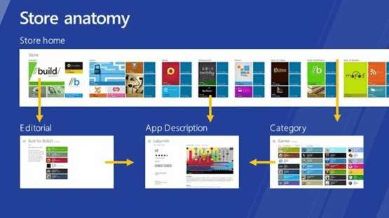
The Windows Store will launch next month as part of the Windows 8 beta. To maintain interest while we wait for this to happen, the Store client team has released details of its user experience, including a video. It's all very touch-driven and makes the split between Windows and Metro all the more obvious. In the blog post Designing the Windows Store user experience Jonathan Wang explains that one principle of the Windows Store was to enable customers to easily discover and quickly acquire apps He goes on to introduce the Store anatomy: the landing page, editorial topic pages, app listing pages, and so on, looking at how the Metro-style has been applied.
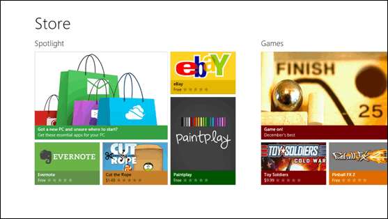
The landing page has been "designed for discovery". It uses minimal chrome and brings content to the forefront.
Navigation, which is optimized for touch, is consistent with Windows 8 Metro style UI, with the idea that will be familiar and easy for Windows 8 users to find their way through the Store. Installing apps on Windows 8 will be simple - a tap on the app listing page will be sufficient for free and trial apps (as long as you are signed in). Although password confirmation for each purchase is the default for paid apps, this can be switched off. Rather than making you stare at a progress bar, as soon as the installation starts, you'll be taken back to the previous page you were looking at so you can continue shopping. All this is explained in Jonathan Wang's video:
Another feature is for updating to be an easy experience with notifications and automatic background download of updates - something that can be switched off if you don't want it.
For customers with multiple PCs, Windows Store apps will be installable on five Windows 8 PCs. Once that limit is reached users will be prompted to remove a device to make way for an additional one. So this means we have a buy once use on up to five devices policy. Only Metro-style apps will be downloadable and purchasable from the Store. However, desktop apps that gain Desktop App Certification can also have app listing pages making them discoverable in the Store via searching and browsing. For purchase customers will need to follow the included links to the app developer's website. All of this reinforces the identity of Metro-style apps as for tablets and traditional Windows apps for the desktop. This two-tier system isn't going to help convince users that Windows 8 is a single coherent system - but of course it isn't. If we are playing by such very different rules, from development APIs to the way that apps are presented to the end user, why do traditional Windows programmers (and indeed users) have to put up with a touch screen optimized front end? Why don't we, and Microsoft, just accept the fact that Windows Metro is a new operating system?
More InformationDesigning the Windows Store user experience Related NewsWindows Store Details Announced Windows Store for developers blog
Comments
or email your comment to: comments@i-programmer.info
To be informed about new articles on I Programmer, subscribe to the RSS feed, follow us on Google+, Twitter, Linkedin or Facebook or sign up for our weekly newsletter. 
|
|||
| Last Updated ( Monday, 23 July 2012 ) |