| Android Adventures - The ConstraintLayout |
| Written by Mike James | ||||||
| Monday, 27 March 2017 | ||||||
Page 2 of 5
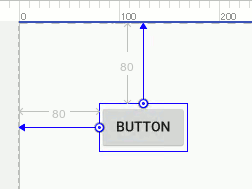
Where things get difficult is when you have a multi component layout and need to make radical changes. Often it is easier in this case to delete all of the constraints and start again. As long as the right constraints are in place the ConstraintLayout works much like the RelativeLayout. For a component that has been placed on its own close to the top and lefthand edge and the screen then constraints will be added that fixes its distance from the left and top:
From now on when the button is displayed it will position itself at 80 from the left and 80 from the top. These constraints are applied no matter what the size of the physical screen is. It is worth knowing that, as in the case of the RelativeLayout, the actual positioning is achieved by setting the button's margin properties to 80. If you move the Button closer to the right-hand edge then it will not change to position relative to that edge of the parent. Once a constraint is set it stays set unless you delete it and apply a new one. The Properties window can help you in a number of ways. The first is that it has a diagram that shows you the currently applied constraints and lets you modify them and set distances exactly:
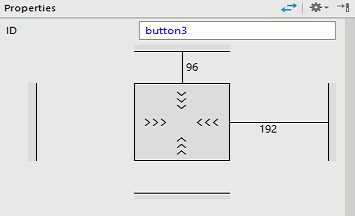
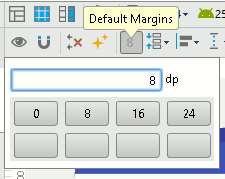
If you click on one of the constraint lines then you can enter a value for the distance. You can also click on the X that appears and delete the constraint completely. You can also set the default margin that is used for new constraints using the default margin icon in the menu bar:
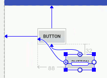
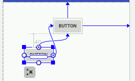
Just like a RelativeLayout, you can set constraints relative to the parent or relative to other controls in the layout. If you place a second button on the surface and move it close to the first. Now if you click the infer constraints button the constraints that are applied are taken relative to the first button:
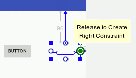
You can see that in this case the second button is positioned 88 from the left edge of the first button and 32 below it. Once again these constraints will be obeyed no matter how larger or small the physical screen the UI is displayed on. What is more if you move the first button the second button will keep its position relative to the first. This is exactly like the RelativeLayout and as long as you set the correct constraints anything you can do with RelativeLayout can be done with ConstraintLayout. If you play with the positioning in the Designer you will quickly get the idea. Manual ConstraintsThe big problem with inferring constraints is that the system sometimes gets it wrong. When this happens you can place constraints by positioning manually. All you have to do is drag a line from the constraint circles on the component to the edge you want to use as a reference point. For example to position the button relative to the right side of the screen simply drag the circle on the right of the button to the right side of the screen and then move the button where you want it:
Constraints can be applied automatically or manually and they often set the distance from some point on the component to a point on some other component. For example, if you want to place a component relative to another then simply drag the constraint point on the first to and edge of the second. In the case shown below manual constraints have been applied because constraint inference would have placed constraints on the left hand edge of the screen:
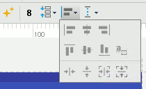
At this point it is worth making a small but important point very clear. While you can manually set negative margins in the RelativeLayout you cannot make use of them in ConstraintLayout. You can drag a component so that it needs a negative offset and this will show in the margin properties as a negative offset but it will be treated as zero by the layout. What this means in practice is that if you align the left side of a component to the left side of another then the only type of constraint you can apply shifts the second button to the right – if you try to move it to the left then the negative margin that would result is ignored. To understand this try it in the Designer and you will find that you cannot drag the lower button in the screen dump above beyond the left side of the top button. In the same way you cannot drag the lower button above the bottom of the upper button. This has a certain logic but it is also restrictive because it means you cannot set a constraint that connects the top of a component to the top of a component that is below it say. You can use left-side to left-side constraints to left align components and right-side to right-side constraints to right align components and so on. To help you do this there is an alignment tool:
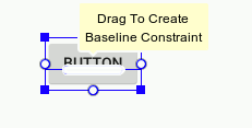
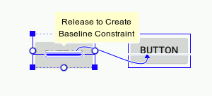
To use this select all the components that you want to align and then click the desired alignment tool. It is important to realize that using these alignment tools simply applies the appropriate constraints. You could achieve the same results by applying the constraints yourself manually As well as being able to align different sides of a control you can also set a baseline constraint so that text lines up. If you look at the Button in the Designer you will see that inside it there is a small elliptical box:
This represents the text in the Button and you can use it to setup a baseline constraint. All you have to do is select the TextView and hover the cursor over the elliptical box until is highlights and a message about dragging to create a baseline constraint appears - as in the screen dump. Next drag from the elliptical box to the baseline of the text in another button, or any component that you want to align the baseline with. If you want to remove the baseline alignment then all you have to do is select the TextView, hover over the elliptical box and click when the remove baseline constraint appears. Bias ConstraintsSo far the ConstraintLayout hasn't really offered us anything new. If you drag a constraint to the left and one to the right the result is a horizontal bias that can be used to position the control at a percentage of the layout size. You can do the same thing by dragging constraints from the top and bottom.
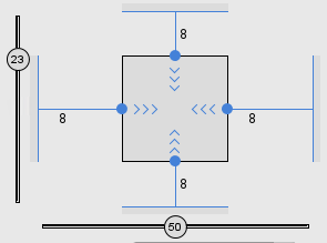
As you drag the control around the screen the percentages are updated. Alternatively you can use the sliders that appear in the Property window to set the percentages.
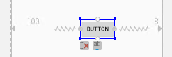
Things are just a little more complicated in that you can also specify a margin. In fact a bias constraint is a mixture of a relative constraint and a bias constraint. If you look a the display in the Properties windows shown above you can see that the constraints also have a value of 8 displayed alongside them. This is the default margin assigned when you created the constraint. As you drag the component around the screen you cannot position it closer than the margin set in that direction. For example is you edit the left margin to be 100 then the constraint display acquires a straight portion 100 units long. If you now try to move the button to the left you will find you cannot get close than 100 units. Notice that it is the distance between the specified margins that is divide up in the ratio set by the bias. If you want the entire screen to be used then set the margins to zero. |
||||||
| Last Updated ( Monday, 27 March 2017 ) |