| Windows Phone 7 - using the Pivot control |
| Written by Mike James | ||||
| Monday, 11 October 2010 | ||||
Page 1 of 3 The Pivot control is perhaps the easiest of the Windows Phone 7 display controls - but it still has one or two interesting twists. Then there is the question of which should you use - the Panorama control or the Pivot control? They seem to offer very similar features. 
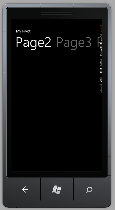
More Windows Phone Articles: Windows Phone 7 - the Panorama Control Windows Phone 7 - the Bing Maps Control Windows Phone 7 - Snakes on a Phone Part 1 Getting started with Windows Phone 7 The two large UI controls in Windows Phone 7 are the Panorama control and the Pivot control and one of the big mysteries for beginners is - why two? A good question and to some extent it is true that a single control could be created that would be adaptable enough to do both jobs. However this isn't how things are organised at the moment and so you have to make a choice of which one to use. Pivot or PanoramaWhat is common to both controls is that they are ways of coping with the smaller screen area available on a mobile phone and they both automatically provide gesture support. The user can move around the content using a horizontal flick (tap and swipe) or pan (tap and drag). The big difference between the two controls is that the Panorama control is better suited to content that is uniform but too big to fit. The Pivot control, on the other hand, is better at presenting content that is logically divided into identifiable sections. The Panorama control divides the content into pages and the user can browse though it by panning. The content is unified by a background that spans each of the sections and scrolls with it. You can also arrange for the content of each section to scroll horizontally and so "spill over" onto adjacent sections. The Pivot control is much more rigidly split into "pages" that the user can pan to or select from a menu. It is worth saying that while it isn't wrong to call the Pivot control a "pivot" control it isn't strongly related to pivot tables or to the complex and sophisticated data displays that can be created using a pivot table control. The Pivot control is more like a "page" control - and it might be less intimidating if it was so named. BasicsThe basics of using the Pivot control are very simple. The control itself acts as a container for as many PivotItems you care to place within it. That is the basic structure is <controls:Pivot> The content of each page can be any mix of Silverlight controls you care to use. You can't use any other container controls within the Pivot control other than a PivotItem. If you give a PivotItem a Header then this appears as a menu item at the top of the page. Only as many header menu items appear as can fit on the page and they "rotate" with the pages so that in most cases you can see at least the menu item for the current page and the next page to the right. For example: <Grid x:Name="LayoutRoot" This creates a four-page layout with menu items at the top but you can generally only see the menu items for the current page and the next page to the right, e.g. Page 2 and Page 3:
<ASIN:0672333481> <ASIN:1430229284> <ASIN:0470922443> <ASIN:0470886595> <ASIN:1449388361> |
||||
| Last Updated ( Monday, 11 October 2010 ) |