| Getting started with the Bing Maps Silverlight Control |
| Tuesday, 23 March 2010 | |||||
Page 3 of 4

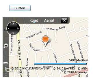
PushpinsMoving on from simply panning, zooming and generally controlling the map view it is also possible to add Pushpin markers and more general shapes. If you used the earlier version of Virtual Earth you will be familiar with the idea of a Pushpin object. This was replaced in the later Javascript/Ajax control with a more general Shape object which could be customised to a Pushpin. In the case of the V1.0 Silverlight control we have returned to using a special Pushpin class and using alternative classes MapPolygon and MapPolyline, both derived from MapShapeBase, for more general shapes. You can also use MapShapeBase to create your own special shape classes. However you can also place any Silverlight graphic on the map in a way that is almost as easy as the specially supplied objects. Let's start with the Pushpin. First you have to create a Pushpin object: Pushpin pin=new Pushpin() This creates a Pushpin at the specified position. To make the pin display you need to add it to the map object: MyMap.Children.Add(pin);
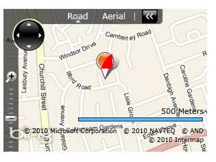
The default Pushpin At this point you might well be wanting to customise the Pushpin but this is more difficult than you might imagine. The Pushpin derives from a ContentControl and as such it is a standard Silverlight object and you can set its Content property to whatever you want the control to display. For example: pin.Content = new Ellipse() {
sets the content to a red ellipse. The only problem is that this displays on top of the default pin graphic.
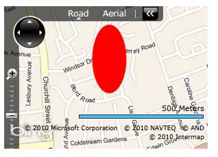
Pushpin with content The default graphic is determined by the Pushpin's control template which is set by the Template property. Currently there seems to be no easy way to modify the Pushpin's template in code so that you can display a custom image or vector graphic. The only, not completely satisfactory, solution is to set the Template property to null. pin.Template = null; If you do this the ellipse shows without the default pin graphic but it is still cropped to the default size which is 41x35. To allow the entire ellipse to show we simply have to set the size of the pin. Putting this all together: Pushpin pin=new Pushpin()
A custom Pushpin Of course you can set the Template property using XAML in the usual way using a Resource. To do this it is easier to add to the Application Resources. Open App.xaml and change it so that the <Application.Resource> section reads: <Application.Resources> You also need to add the attribute: xmlns:m="clr-namespace:Microsoft. to the Application tag so that the "m" prefix is defined. With this resource defined you can set the appearance of a Pushpin dynamically in code using: Pushpin pin=new Pushpin() Of course you can do the same thing in XAML by setting the Template property of any Pushpins you define.
You can also create more complex Pushpins by setting content to a layout grid which in turn is set to contain multiple items - as in the previous example where the Ellipse is nested within a Grid container. . <ASIN:6130049056> <ASIN:1590597079> <ASIN:0321525590>
|
|||||
| Last Updated ( Monday, 26 July 2010 ) |