| Monitoring a fitness regime |
| Written by Janet Swift | ||||
| Thursday, 29 April 2010 | ||||
Page 3 of 3
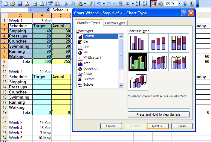
Charting weekly dataWe now want a chart to compare Actual exercise for each activity during the week with the Target. Select the cells containing the activity titles together with the Target and Actual data, i.e. A2:C8 and click the chart icon to open the Chart Wizard. Step 1 is where you selelct an appropriate Chart Type. A column chart is a good choice for this and looks better with a 3D effect so make this choice:
(Click inside picture to expand it) Click Next and you will see a display of the chart so far.
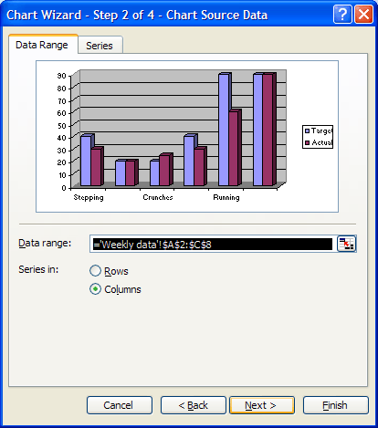
We don't want to make any changes in Step 2 so press Next. 
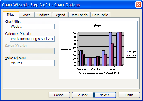
At Step 3 there are various tabbed boxes. In the first tab, Titles, enter "Week 1" as the Chart title; "Week commencing 5 April 2010" in the Category axis box and Minutes in the Value axis box.
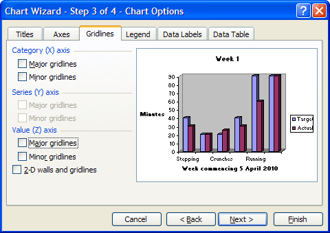
Click on the Gridlines tab and remove the grid lines by clicking in the Major Gridlines boox in the Value axis section to remove the tick there.
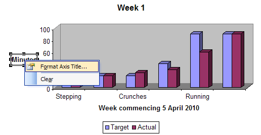
Click on the Legends tab and select Bottom as the Placement.. Then click Finish. This puts the chart into the same spreadsheet as the data and you can move and size it with the mouse. AlignmentThe chart would look more professional with the y-axis label displayed vertically rather than horizontally. To do this hover the mouse over the label so that the tip box "Value Axis Title" appears. Then to open the Format Axis title dialog either right-click the mouse and choose Format Axis Title or use the Ctrl+1 keyboard shortcut. (For more information about tip boxes in charts see Part 3 of this series).
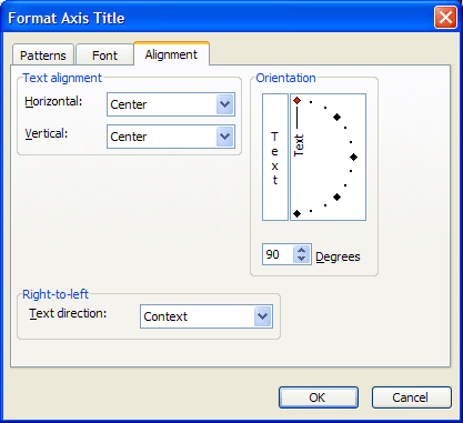
Click on the Alignment tab and move the pointer in the Orientation box to point upwards (alternatively enter 90 in the Degrees box). Click OK.
Color controlIn the spreadsheet we used shading in Light Green and Yellow Target and Actual respectively. So it would make sense to use these colours in the chart. Click on one of the Target colums - this selects all of them. From the Fill Color icon in the toolbar select the same Light Green shade as used for Target in the data table for . Then repeat with operation by clicking on one of the Actual Bars and filling with Light Yellow. Notice that the legend automatically updates to reflect the changes. 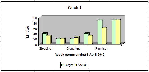
(Click inside picture to expand it)
If you want to see an example version of the Excel spreadsheet so far download Fitness2.xls. When you are ready, you can proceed to the final part of this series for charts that will demonstrate your performance success over several weeks and provide a future forecast.
<ASIN:027371404X> <ASIN:1401603734> <ASIN: 0470037377> <ASIN:0596528345>
|
||||
| Last Updated ( Sunday, 09 May 2010 ) |