| Microsoft's Logo Evolution |
| Written by David Conrad | |||
| Sunday, 16 September 2012 | |||
|
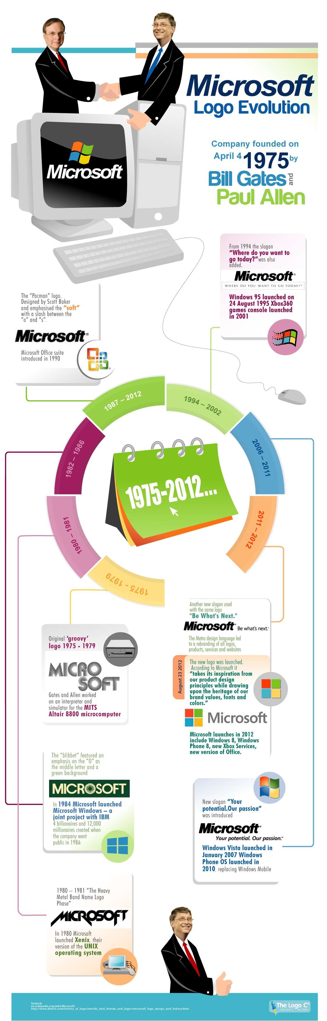
Microsoft's recent logo change, the first for 25 years, has prompted a look back at the changing style of computing. It is inevitable that company logos and overall style should reflect the style of the time. So it is with Microsoft. When you look back at the logos keep in mind that Microsoft has never been a particularly "stylish" company, but it has had its share of fashions. Of course all of this has changed with Microsoft needing to compete with the style icon that Apple has become. It seems unlikely that the current logo will last 25 years as Microsoft attempts to use style as a way to stay on top. This infographic of Microsoft Logo Evolution comes from the team at The Logo Company. Click for larger Image
So which one do you like the most? My guess is that if you have been using Microsoft software for a while it will be the one that corresponds to a golden era for you, rather than anything to do with design or style.
More InformationRelated ArticlesA New Microsoft Logo - Sign Of The Times Microsoft Ignores Usability and Users - VS 2012 Keeps ALL-CAPS Menus Visual Studio 11 Goes Color - Slightly
Comments
or email your comment to: comments@i-programmer.info To be informed about new articles on I Programmer, install the I Programmer Toolbar, subscribe to the RSS feed, follow us on, Twitter, Facebook, Google+ or Linkedin, or sign up for our weekly newsletter.

|
|||
| Last Updated ( Sunday, 16 September 2012 ) |