| Android Adventures - Layouts 2.3 |
| Written by Mike James | |||||||
| Thursday, 19 March 2015 | |||||||
Page 2 of 6
UnitsIf you are going to enter a fixed size or a location then we need to know how to do it. Android supports six units. Two are related to pixels: px - pixelsThis is the unit that it is most tempting to use when you first start creating an app because you generally have one testing device in mind with a particular screen size and resolution. This is not a good idea if you want your app to look roughly the same as screen resolution changes. dp - density-independent pixelsThis is the most often used unit because it adjusts for the screen resolution. If the device has a screen with 160 pixels per inch then 1dp is the same as 1px. If the number of pixels per inch change then the dp to px ratio changes in the same ratio. For example at 320 pixels per inch 1dp is the same as 2px. The point is that by using density-independent pixels you can keep controls the same size as the resolution changes. Notice that this does not compensate for the screen size. If you keep the number of pixels fixed and double the resolution then the screen size halves. A control on the screen specified in px would then display at half its original size. A control specified in dp would display at its original size but take up twice the screen real-estate. The point is that using dp protects you against screens changing their resolution, not their physical size. If you specify sizes in dp then your layout will look the same on a 7-inch tablet, no matter what resolution it has. As well as pixel-based measures there are also three real world units: mm - millimetersin - inchespt - points 1/72 of an inch
All three work in terms of the size of the screen and the number of pixels a control uses is related to the screen resolution. If the screen has 160 pixels per inch then 1/160 in=1 px and so on. Notice that once again these units protect you against resolution changes, but not changes to the actual screen size. Your button may be 1 inch across on all devices but how much of the screen this uses up depends on the size of the screen the device has. The danger in using real world units is that you might well specify a fractional number of pixels and end up with an untidy looking display. The final unit that is also related to pixels but is tied to the user's font size preference: sp - scale independent pixelsThis works like the dp unit in that it is scaled with the device's resolution but it is also scaled by the users default font size preference. If the user sets a larger font size preference then all sp values are scaled up to match. What should you use?Simple - use dp unless you have a good reason not to because this at least means that if you have tested your UI on a device of size x it should work reasonably on all devices of size x, no matter what the resolution. Android Studio defaults to working in dp whenever you enter a value without a unit or when you interactively size or move a control.
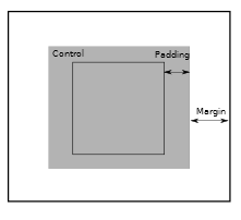
A Control Is Just A BoxAs far as a Layout is concerned a control is just a rectangle. Its size is given by layout_width and layout_height and these can be set by the control or, more often, by the Layout. Once the Layout knows the size of the control it can position it according to the rules you have established using the Layout's properties. If you want to know the position that a control has been assigned then you can use its getTop and getLeft properties. This gives you the position of the top lefthand corner of the control's rectangle. You can work out where the other corners are using getWidth and getHeight, but to make things easier there is also getRight and getBottom. Notice that the position of the top lefthand corner of the rectangle is always relative to the Layout it is in - that is, the position is not an absolute screen position. It is also worth knowing that controls also support padding and some Layouts support margins. Padding is a dead-space inside the control that acts as an space between the edge of the control and its contents. Margins, and not all Layouts support margins, are dead-space outside of a control that can be used to add space between controls.
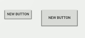
Notice that padding is a property of the control and margin is a layout property. You can set each margin or padding on the left, right, top or bottom individually or to a single value for all of them. In theory padding is used to put space around the content of a control, but it can also be used simply to make the control bigger when its dimensions are set to wrap its contents. For example. the Button on the left has zero padding and the one on the right has a padding of 30dp all round.
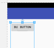
Similarly margins are used to put space around a control but they can be used to position one control relative to another or to its container - this is how the RelativeLayout works. For example, you can see that the lower button is being positioned in the RelativeLayout by setting its margins. GravityGravity is often regarded as mysterious, partly because of its name and partly because there are often two gravity properties. Basically gravity just sets where in a dynamic layout something is positioned. Simple gravity settings are:
The meaning of all of these is obvious - the object just moves to the specified position. However, things get a little complicated if you, say, try to set an object to display at the left when the size of its container has been adjusted to fit, i.e. it is already as far to the left and the right as it can be. You can also set multiple gravity options. For example, you can set left and right at the same time and this just centers the object horizontally. What makes gravity even more complicated is that there are settings that change the size of the object affected:
In each case the object grows to fill the specified dimension. There are also two clipping gravities:
these work with the top, bottom, left and right to clip an object to fit the container. For example, if you set gravity to top and clip_vertical then the object will be positioned at the top of the container and its bottom edge will be clipped. Most of the time you will simply use gravity settings like center or top. If you try to use complicated combinations then things tend not to work as you might expect. The final complication, which in fact turns out to be quite straightforward, is that controls have a gravity property and Layouts provide a layout_gravity property. The difference is very simple. The gravity property sets what happens to the contents of a control and the layout_gravity sets how the control is positioned in the Layout container. For example, if you have a Button and you set its gravity property to top then the text within the button will be moved to align with the top. If, on the other hand, you set the Button's layout_gravity to top the whole Button moves to the top of the Layout container. Notice that not all Layouts provide a layout_gravity property to their child controls. The FrameLayoutThe FrameLayout is the simplest of all the Layouts. It really doesn't do very much to position the controls it contains. Its intended use is to host a single control, i.e. it really does just act as a frame around a control. The new layout editor doesn't provide as much help with FrameLayout as it did. When you drop a control in a Framelayout it is positioned at the top left. You also cannot drag a control to a new position within the layout. To set a controls position you have to find the layout_gravity property and set one or more of top, bottom, left, right, center_horizontal, center_vertical. You can use this to position multiple controls in the same FrameLayout, but notice that if the total size changes the different controls may well overlap.
If two controls overlap in a FrameLayout then they are drawn in the order in which they were added. In other words, the last one added is drawn on top of the others. This aspect of the FrameLayout makes it useful if you want to display multiple controls and switch between which one is visible. Simply put all the controls into the FrameLayout and select one to be visible using its visible property. More commonly a FrameLayout is used simply as a placeholder for a component of a layout that isn't specified until some time later. For example, if you make use of a Fragment, see Introducing Android Fragments, to create part of a UI or read in a list of things to display, then often you need a container for the new component to be present in your static layout. A FrameLayout does the job very efficiently. Use a FrameLayout when you need the simplest Layout that will hold one or a small number of components without the need for much in the way of positioning or sizing. |
|||||||
| Last Updated ( Monday, 27 March 2017 ) |