| The Responsive Web |
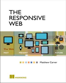
Author: Matthew Carver If you are wondering what the responsive web means the cover of this book provides a clue. In the middle panel depicting the present you see the range of screen sizes that today's websites have to cater for. The very first paragraph of the preliminary About this book section sums up responsive web design very succinctly: Responsive web design is a technique of designing websites that scale for various browsers, including mobile, tablet, and desktop. It's made possible through CSS3 Media queries and offers developers the opportunity to design a site once for multiple devices. This sets the tone of the whole book. Matthew Carver has organised his material with a clear overall structure and makes good use of page furniture to assist the reader. Every chapter opens with a box that lets you know what is going to be covered and there are boxouts for Designer Insights, Developer Insights and sometimes combined into Designer/Developer Insights. Although there's no colour, illustrations are all useful and informative. Plenty of code is included presented as annotated listings annotated and also made available online. The book has nine chapters and is divided into three parts.

Part 1: The Responsive Way has two chapters and from the start Matthew Carver takes a very practical approach. In Chapter 1, After an overview of a responsive workflow, in which he introduces media queries and breakpoints he embarks on building a responsive site, with the initial step being to prototype it. Carver explains that he likes to use rapid prototyping and the to do this he introduces Foundation 3 by Zurb, a front-end framework for rapid site production. The latest version of the Foundation Library is Foundation 5, something the author notes before launching into to his description of its features. Before long we get down to building a simple responsive site, starting with a sketch and proceeding to producing a browser-based prototype using Foundation's built in 12-column grid system. Next Carver looks at writing efficient HTML for mobile-first markup, after which he moves on to using of percentages to provide a scalable container element in CSS. At the end of the chapter Carver points out how collaboration between designer and developer is important for responsive web design. The reason why you should adopt mobile-first design, that is start with the smallest screen, and the challenges it presents, are covered in the next chapter along with a discussion of designing for a touch interface. Chapter 2 also looks at the use of web fonts in layouts and looks at three of the available services: Typekit, Fonts.com and Google fonts as well as the option of self-hosting fonts on your own server.
The next four chapters are in Part 2 which goes deeper into Designing for the responsive web. Chapter 3 introduces the idea of using style guides and goes on to outline how to create a style tile. In the next chapter Carver moves on to design patterns and uses two – the toggle navigation pattern and the select menu pattern – to solve the problem of top-level navigation in responsive design. Chapter 5 returns to an idea introduced in the first chapter – using percentages to create fluid layouts – and again focuses of grid systems and adapting page layouts through screen size changes. To round out this part of the book Carver starts a discussion of the challenges of responsive content with a look at how content can adapt to changing screen sizes.
Part 3, consisting of three chapters, looks at Expanding the design with code. Chapter 7 discusses adding graphics to a page and covers responsive background images and videos. After considering using CSS to implement design, Carver looks at the use of icon fonts and SVG (Scalable Vector Graphics). Chapter 8 comes back to an idea introduced early in the book – progressive enhancement, which is explained as a technique for making a simple site into something more technologically advanced, and guards against obsolescence. Carver says: This process is a counterpoint to mobile-first design. Mobile-first design deals directly with form, whereas progressive enhancement deals with function. Having looked at the methodology of progressive enhancement, he turns to an alternative - . graceful degradation. Next he introduces Modernizr, a JavaScript library used to detect features in the browser which is loaded in the head of a page and runs during page load. After a detailed overview, and a simple example, we add Modernizer to the site that we've been working on throughout the book. Chapter 9 turns attention to the topic of responsive testing using simulated testing environments. Explaining that his preferred development environment is OS X, Carver looks at the pros and cons of using Parallels for Mac, which allows you to build simulated environments as virtual machines. He also looks at the iOS Simulator included in Xcode. After a short discussion of browser tools for testing, there's a deeper explanation of web inspector tool and the chapter concludes with tips on reducing request times. The book rounds out with Appendix a: Context-aware design. A further appendix, relating to the Foundations framework is available online. This is a well organized, well presented and well written book. It is worth noting that as with all Manning titles, purchase of the book gives you access to PDF, ePub and Kindle versions at no additional cost. Recommended.
|
|||
| Last Updated ( Monday, 29 June 2015 ) |