| Google Mines Music |
| Written by Mike James | |||
| Saturday, 18 January 2014 | |||
|
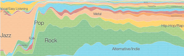
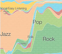
Google's Big Picture Group specializes in creating interesting visualizations of complex data. The latest offering shows you just how the music has changed - unless it's classical music. If you want to see historical trends then you need historical data - right? Maybe not. The Big Picture Group has invented an interesting approach to mapping out how music has changed over time - although you do have to be careful about exactly what that means. The idea is that music albums have an issue date along with their genre. So instead of researching back in time to find out what genres were popular or influential when they were issued why not look at what albums are thought to be important enough to be owned by present day listeners. The data comes from Google Play Music and represents a snapshot of the albums that user have in their music library. Popularity of a given album is simply the number of people with it in their library and not in anyway on how often it is played. The raw data has been processed using d3.js which provides a way of creating documents that are linked to data. Think of it as a data-binding library for HTML/CSS (and of course SVG). The rest of the system makes use of Google's Closure tools The resulting interactive chart shows the popularity of different genres from different times in today's typical music library. The thickness of each line shows the proportion of each genre identified by arbitrary color assignments. Notice that the data is also normalized by the number of albums in each year to account for the growth in total music output. If you will see a selection of album covers in the associated genre. (click in chart to enlarge) So what does this visualization tell you? Because it represents a snapshot of music consumption and preferences now and not in the past you can draw conclusions like: music, consumed to day, from the 50s is mostly Jazz. Perhaps you could also say things like: "of all of the music of the 50s jazz is the genre that has best survived to today". If you want a headline you could even write "The golden age of jazz - 1950 to 1960". It isn't really a look at historical trends, but how the past is viewed by the present. What about classical music? The problem with including it in the chart is what date to you use? For a popular album its release date is likely to be correlated with the date the music was created. For a classical album you can have a 2014 album of 6th century plainchant. However as particular classical genres are linked to particular time periods perhaps there is another analysis waiting to be done. To paraphrase Archimedes: give me the data and a place to analyse it and I will rock the world.
More InformationRelated ArticlesHow the Music Flows from Place to Place Google Support For Free Internet Twitter Used To Map Happiness In New York
To be informed about new articles on I Programmer, install the I Programmer Toolbar, subscribe to the RSS feed, follow us on, Twitter, Facebook, Google+ or Linkedin, or sign up for our weekly newsletter.
Comments
or email your comment to: comments@i-programmer.info

|
|||
| Last Updated ( Saturday, 18 January 2014 ) |