| JQuery Mobile 1.3 For Responsive Web Design |
| Written by Ian Elliot | |||
| Tuesday, 12 February 2013 | |||
|
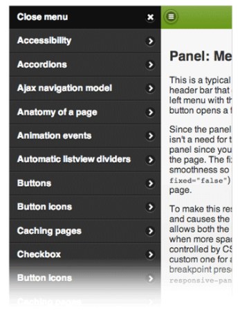
The jQuery Mobile team has announced the first release candidate for 1.3.0. It features a new panel widget, dual handle range sliders, and two different responsive table modes. jQuery Mobile conforms to the idea of responsive web design (RWD) in that it has been designed to work on all devices and platforms - not just mobile phones but also tablets and desktop browsers. The focus in jQuery Mobile 1.3 is on educating its community on RWD and with this in mind it has responsive documentation and demos that explain key RWD concepts as well as new widgets like responsive tables, panels and grids. According to Todd Parker, writing on the jQuery Mobile blog: We’ve seen the question “What should I use: RWD or jQuery Mobile?” many times on Twitter and our response is an unqualified “both”. Think of jQuery Mobile as a set of touch-friendly UI elements that are designed to fit within your responsive design. Version 1.3 introduces a new widget for panels that open to reveal a menu, form or other content. They can be positioned on the left or right of the screen and be placed flexibly in the HTML source order. The widget provides three different ways to open a panel: The default reveal display slides the page away to show the panel beneath, the push display animates both the panel and page, and the overlay display places the panel on top of the page. Panels can be closed by swiping, tapping onto the page, or hitting the Esc key on the keyboard. This example has a left nav panel and right panel with a form:
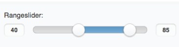
A widget for a dual handle range slider has been added in response to popular request:
Responsive grids are the essential to responsive design and jQuery 1.3 has detailed instructions on how to create your own media queries to adjust grids at various breakpoints. It also provides a preset breakpoint that can be applied by adding a class to your grid wrapper. This will apply a CSS breakpoint at narrower screen widths that stack all the grid blocks instead of floating them. This is a simple way to make your grids a bit responsive and fit better on phones.
Two different responsive table modes are included in jQuery 1.3:
The jQuery team has also been re-factoring its AJAX nav system to make is easier to use and more consistent across browsers. Version 1.3 has a new Navigate event and method and has a listview reveal feature to make autocomplete with local data easy.
More InformationjQuery Mobile 1.3.0 RC1 Released Announcing jQuery Mobile 1.3.0 Beta Introduction to Responsive Web Design Related Articles
To be informed about new articles on I Programmer, sign up for our weekly newsletter, subscribe to the RSS feed and follow us on Facebook or Linkedin.

Comments
or email your comment to: comments@i-programmer.info |
|||
| Last Updated ( Friday, 12 May 2017 ) |