| Insider's Guide To Udacity Android Developer Nanodegree Part 5 - Make Your App Material |
| Monday, 30 October 2017 | ||||
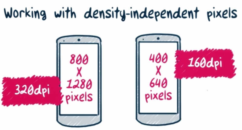
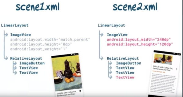
Page 1 of 3 Having embarked on this account of the Android Developer Nanodegree, designed by Google and delivered through Udacity's platform, in March, we've already covered a lot of skills. This part tackles mission impossible, turning a Coder into a Designer. I always aim for functionality first and design second, something clearly evident in my Nanodegree projects submitted thus far which satisfied just the UI essentials but also in my other unrelated-to Android-work, such as Ultimate Extract and Recover, a Win32 application and Smart Device Seeker, a Website about smart devices. So "design second" doesn't pertain just to Android applications but crosses boundaries and I guess that's something prevalent to most backend-oriented developers out there. This has to change since design plays a big role in what breaks or makes success and, with so much competition in the Android store, producing just a functional application is not enough. This makes sense since the user's first encounter is with the 'get to know' phase that depends on the aesthetic, layout, setup and organization part of the application, taking place much earlier than the functionality assessment phase. Thankfully, as there's patterns for everything, so there are for designing UIs and on the Android platform they're collectively known as 'Material Design'. In addition to standardizing aesthetics with color palettes, typography, imagery and so on, Material Design also sets up a common ground for all Android apps to be built upon so that end users are able to transfer their experience of using one app to the using of another. That's why the 'Hamburger' icon, the rounded Contacts of Gmail, the flipping of pages by swiping left and right are patterns so frequently met across all Android applications. Then again, while 'Material Design' might be the recommended way, it does not enforce strict or uncrossable boundaries, as any app is free to deviate when necessary, typically when wanting to infuse the brand's signature and that feeling of uniqueness. The class is organized in 5 distinct units including the end project: Android Design Fundamentals Understand and apply the fundamentals of Android design to your app, and experiment with app structures, common navigation patterns and themes. Surfaces Understand how to use surfaces to structure the hierarchy and interaction of elements in an app. Bold Graphic Design Understand and apply branding guidelines -- including key lines, metrics, fonts, typographic scale, color palette and themes/styles. Meaningful Motion Understand the use of motion in apps, how to use transitions to change app states and properly choreograph the motion in an app. Adaptive Design Understand how to refine and test your designs on for use on multiple form factors. Project 'Make Your App Material' In this project, you will update the look and feel of an app to meet Material Design specifications. In detailIn more detail, Unit 1 acts as a crash course in Android design fundamentals looking at it from 20,000 feet and explaining that Material Design borrows and transfers ideas from the physical and print design world to the virtual one of building UIs.It then shifts its focus onto building those UIs which run on all kind of Android devices, from smartphones to wearables, adapting to the requirements of each distinct environment. Therefore the rest of the lesson is on topics such as Working with Density-independent pixels, Calculating Dips, Grouping devices into Buckets and Customizing layouts with resource qualifiers. Included is a rundown of the types of layouts available on the platform; frame, linear, relative, grid etc.
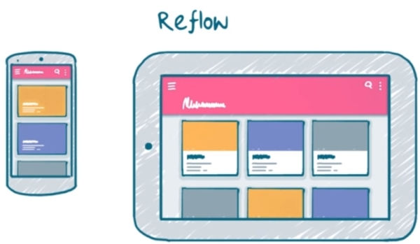
In my opinion Unit 5 should have had come straight after Unit 1. It deals with the same principles but further expands on them by talking about responsive design. You learn about setting break points that when hit perform predefined actions such as balancing white space, reflowing content, making UI elements appear or disappear and so on. If you are familiar with HTML and Bootstrap, they act like: // Small devices (landscape phones, 576px and up) @media (min-width: 576px) { ... } or // Medium devices (tablets, 768px and up) @media (min-width: 768px) { ... }
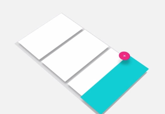
So tackling Unit 5 immediately after Unit 1 seems the most logical step to take in order to obtain a spherical overview of device sizes, orientation and responsive design. Continuing with the rest of the material, Unit 2 goes through establishing visual hierarchies to make UIs comprehensible in just a glimpse.Surfaces are perfect for this purpose as they can group UI elements such as icons, photos, buttons and so on according to functionality.Utilized correctly make the app easier to interact with as they are able to funnel the user's attention to the important UI elements or hint of taking an appropriate action.The floating action button or FAB is such an example.It comes rendered with greater elevation than its neighbours and casting shadows over its surface to hint of its usage for common, frequently taken actions.
Unit 3 is about using space, color, typography and imagery so the topics discussed range from Applying Color to Picking Fonts, to Making Images More Immersive.This includes a rundown of Cognitive Psychology and the Gestalt Laws of Grouping which collectively govern the way we interact with the physical world.The most prevalent of those laws is the Law of Past Experience.It is reminded that once upon a time and under this rule, computer applications were emulating the physical world through metaphors such as notepads, calendars and so on, but as they grew bigger, richer and more intuitive, finding real world counterparts was no longer fruitful.As such the switch to purely virtual models to which the user, thankfully, started quickly adapting to.The rest of the laws, that of Proximity and Similarity, govern the way we recognize and group related things together.Truth is that if it wasn't for the Android Studio dedicated videos, this Unit could easily go down as a totally separate course on Design theory.
Unit 4 is all about utilizing animation to provide a continuous and smooth experience by easily conveying complex state changes and making the user feel in control.This is followed by a historical rundown of the platform's Animation API's and their evolution throughout time as well as the kind of Transitions available on the platform the likes of Activity Enter, Activity Exit, and Shared Element.
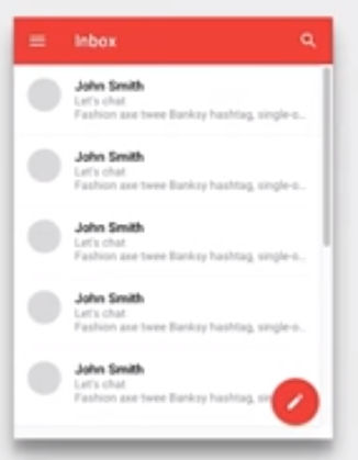
The studying material is so thorough that it easily overwhelms.In case you find it difficult to figure out where to start from, it's best to focus on the class's project rubric as the definitive guide. The project on itself is used as means of applying the Material Design guidelines on a mock RSS feed Reader, which although fully functional is in need of serious revamping.Its elements, buttons, images, FABs, and so on, should be refined according to the official Material Design rules. In the course of the project you'll find that in replacing its ageing components with their modern Material Design counterparts, that most of the old code will be thrown away.As a consequence the app becomes much simpler in both coding and logic.
|
||||
| Last Updated ( Monday, 20 November 2017 ) |