| Android Adventures - Building The UI |
| Written by Mike James | ||||||
| Tuesday, 17 February 2015 | ||||||
Page 2 of 5
So positioning in a relative layout is with respect to the container - this is just the first option. However, things get a little more complicated as soon as we have more than one Button, or in general any component, in the layout. If you click to place a second Button and then move the location around the screen again you will notice that now alignments are shown for the first Button as well as the parent. In a relative layout you can set the position of a component relative to the parent container or to any of the other components in the container. The Designer positions the component you are using relative to the nearest component or the parent container.
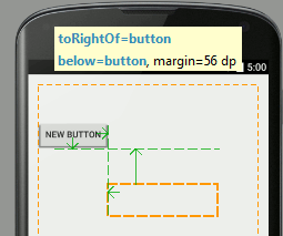
What this means is that if you position a second button relative to the first then the second button moves if you reposition the first - try it to see how this works. The two buttons move together if you move the first button. What is less obvious, but logical, is any relatively positioned components will move if the aspect of the component they are positioned against move. For example, if a component is positioned relative to the right side of another component then making the component wider moves the component that is positioned relatively to it. As you might guess there are a set of properties that you can use to position one component relative to another layout:alignComponent has pairs of sub-properties connecting two components. For example top:top gives a relative position of the top of one component with the top of another, similarly left:right positions the right side of one component to the left side of another. In each case you also have to supply the text Id of the component that is to be aligned to. This all sounds very complicated and it might leave you thinking that it is all unnecessary. However it means you can build sets of components all aligned to one that is aligned to the container so that they all move together as a group. It means you can place one component with an offset from another no matter what the size of the first component is. You can also set components to align with the left and right side of the screen and allow for rotation from portrait to landscape. However all this said it is very easy to get into a complete mess with relative layout in the Designer. If components go missing then chances are they are on top of each other. The easiest way to sort this problem out is to go to the Properties window and manually reset one of the positioning properties. It is helpful to notice the following:
It is also worth noting that there are other layout components and you are not restricted to the RelativeLayout componet. The RelativeLayout component is used by default but you can change this for any of the other layout components - Linear, Table, Grid and Frame. There are also other container components which can be used in place of these standard layout components. More of this later. One thing worth knowing at this early stage is that components have layout properties that are provided by their container so the set of properties that we have looked at in connection with the RelativeLayout component are unique to it. That is if you use another Layout then you have to learn its layout properties from scratch. Again this is another topic we have to return to. For most apps the RelativeLayout component is a good choice for a mix of Buttons, Text, Checkboxes and so on. SizingIn comparison to positioning sizing a component is almost trivial. All components have a Height and Width property and these correspond to the drawn height and width when the component is actually rendered on the screen. You may have noticed that there are what look like sizing handles on the components that you place in the Designer. However if you try to drag these to change the size of say a button you will notice that often nothing much happens. The reason is that most components resize to accommodate their contents. This auto-sizing behaviour is set by the layout:width and layout:height properties. You can modify this by typing in an exact size e.g. 100dp into the value box next tot he property. Also notice that you can set a maximum and a minimum size for most components. Setting a maximum will result it the content being truncated if it doesn't fit. Setting a minimum is often the best plan because then the component will increase in size when necessary. GravityNow we come to a property that isn't all that important but it needs to be discussed because it sounds important. Gravity is basically just another name for alignment. If you have a Button and you set its gravity property to Top then the text it contains will align to the top of the inside of the Button. There are a lot of alignment possibilities you can set Gravity to but the majority are fairly obvious. The confusing part is that many components have a text alignment property which can be used to override the Gravity setting. Gravity is more important when used with a different Layout component - the Linear layout when the layout_gravity property sets how the component should align inside the Linear layout - more of this later. The Component TreeIf you look to the top right corner of Android Studio in layout mode you will see a window called Component Tree. This is almost self explanatory and hardly needs much other than to draw your attention to it. However notice that you can see the tree structure of the layout starting at the Layout container. In the case of a default project you can see that the default layout is RelativeLayout and you can see the all of the other components correctly nested within their parent containers.
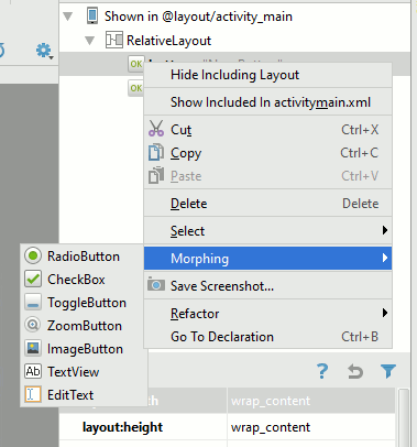
Notice that you can select and delete layout elements directly in the tree. This is useful when you have a complex layout that has gone so wrong that you are finding it hard to select components reliably. One interesting operation that is worth knowing about even if it isn't used very often is Morphing. If you select an element in the tree, right click and select Morphing you will be presented with a list of possible alternatives. So for example you could change a button to a Toggle button an so on. Another option which can be useful is that Hide/Show Including Layout. If you recall in Android Studio 2 there are two layout files. The first activity_main.xml holds all of the standard Android UI elements and the second is your custom layout content_main.xml. The activity_main.xml includes your content_main.xml layout file and the two are shown in the designer together - although you cannot edit the UI elements that are defined in activity_main.xml. You can opt to not display them if they are distracting in some way and concentrate on just what is defined by content_main.xml. |
||||||
| Last Updated ( Friday, 23 September 2016 ) |