| HTML5/CSS Layout |
| Written by David Conrad | ||||
| Sunday, 27 April 2025 | ||||
Page 1 of 3 The HTML default layout rules can be a mystery. They are usually introduced to users late on and as part of achieving something complicated and this tends to obscure the principles. So if you want to get to grips with floated, non-floated blocks, clipping and clear then read on.
One of the problems with trying to get to grips with HTML/CSS is that it is often introduced slowly and with easy and obvious examples. Only later when you are trying to implement something complex do you realize that you never fully understood what is going on. What exactly the rules are that you are playing by? In this article I am going to try to make the rules as clear as possible in the style that a programmer might use to think about layout in general. You could say that the purpose is to describe HTML/CSS as a layout panel or frame. Be warned, however, that the layout rules are fairly strange when compared to the sort of thing you encounter in a flow panel or a grid. ContainersThe first thing to say is that all layout in HTML is with respect to a block container. Block containers are the layout panels of HTML. The confusing thing is that block containers are also block elements which are the objects that the container contains and formats. Put simply a <div> can be a container and it can be an element within a container. Other block elements include image tags, table tags, forms and so on. Another complication is that HTML gave up being about how things are displayed a long time ago. In principle everything that controls the way things are displayed is part of the CSS. So in theory an HTML page is just a nested set of block elements. (We are ignoring in-line elements for the moment as their layout properties are simple to understand once you know how block elements work.) So in principle you can regard a structure like:
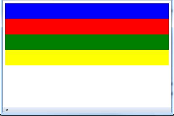
as having nothing at all to say about layout. All it tells you is that there are four divs nested within a top level div. Of course, there is a default layout so this isn't strictly true. Regarding each div as a container the basic rule is that the size of the container is adjusted to accommodate what it is nested in side it. This is usually a good way to work but for our examples we need to give the divs a known size without having to find suitable content so let's simply use the width and height attributes to size them. The default layout method for any container is "vertical". The rule is that unless the size of the container is specified it takes the full available width and as much height as need to contain its child elements. Each child element also takes the full width of the container and hence they are organized one above the other in a vertical stack on the page. To see this in action we need to give each of the inner divs a height and a color:
The result is:
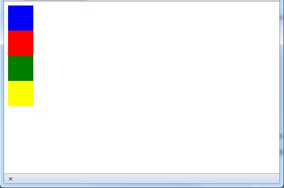
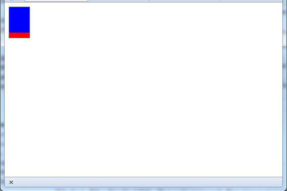
Notice that you have to determine height for a child element either by setting it explicitly or by putting something inside it that has a determined height. Also notice that the container object, i.e. the outer most div, set its size to accommodate its child elements. Also notice the size of a block is determined by the CSS block layout model which includes margins, padding and borders. While this isn't really part of this article's topic you need to be aware that it can change the final size of a block. If you set the width of a child element then the width that it occupies doesn't change but the way it looks does. In other words if you set each of the divs to say 50px wide they appear as squares but each one still starts a new line. To see this change the HTML to:
This produces the result:
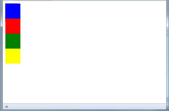
The container and clippingAt the moment the container resizes to show all of the child objects it contains. What if we set the container to a size that isn't big enough for the child objects to display? The answer is that by default the child objects simply overflow the container, assuming that the page has enough space for them. For example, if we change the container div to be in a class of the same name we can set a style for it:
The style can specify a size and a border so that we can see the container:
If you now try this out you will have to look hard to see a difference as the square divs overflow the container. If you look carefully you can just see the border of the container at the top right.
Most programmers find this behaviour odd as containers usually clip their contents. After all what is the point of having a container if its contents just leak out? To set clipping on you need to use the overflow attribute which can be set to
So to clip to the size of the container we simply change the style to:
This produces the result:
You can try out the auto value if you want to, but it just adds a scrollbar. |
||||
| Last Updated ( Sunday, 27 April 2025 ) |