| Getting Started with jQuery UI |
| Written by Ian Elliot | |||||||||
| Thursday, 23 March 2017 | |||||||||
Page 2 of 2
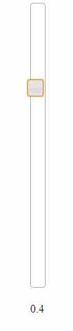
Slider SettingsThis gives you the basic operation of a slider - what else can you change? You can set the max and min values that the slider will return via the max and min properties. You can also set the step size, i.e the amount the slider moves each time using the step property. Finally you can set the orientation using the orientation property. So, for example, to set up a vertical slider working between 1 and -1 with a step size of 0.1 and a display of the value as the user moves the slider. The HTML can be as simple as:
The code is:
If you run this then you will see a vertical slider with the current value changing below it as the user moves the slider.
Range SliderAs well as the standard slider you can also implement a range slider - one that has two sliders, allowing the user to setup a max and min for a range. All you have to do is set the range property to true and then set values to an array giving the max and min properties of the two sliders. For example
creates a slider with two slides ranging between 0 and 100 and one initially set to 25 and the other to 75. You can also have a slider with a fixed max or min by setting the range to "max" or "min"
You can get the values for the sliders using the values() or value(index) methods. For example
returns an array of values. Changing the StyleYou might not be happy with the default style of the slider. To change it all you have is create a new style sheet that applies styles to the standard classes set up by the constructor. You can find out the classes that are used by examining the slider element using the browser's dev tools:
From this you can see that to customize the slider handle you need to modify the ui-slider-handle, the ui-state-default or the ui-corner-all class. The problem is always finding out which one to change. There is a list of standard CSS class names in the documentation but you cannot always rely on their use, especially in third party widgets. You can create complete themed sets of styles using the ThemeRoller where you will also find predefined styles you can use. If you want to do something radical to the slider handle then the best approach is to just use jQuery to remove the assigned styles and apply your own. More jQuery UINow that you have seen how jQuery UI works you can explore the range of components it offers. They all work in more or less the same way as the slider with, of course, features specific to their functioning. You can use jQuery UI to create pages that have tabs or accordion sliding tabs. You can use it to implement popup dialog boxes to get data from the user. There are also many more animation options provided by jQuery UI than just basic jQuery. There are also functions that will implement drag-and-drop on any HTML element. To cover everything in jQuery Ui would take another book. However what you know of the slider widget and jQuery should take you a long way. In the next chapter we tackle a more advanced topic - adding a widget to jQuery UI. Your knowledge of jQuery makes it easy for you to create your own custom widgets but it is so much better to add them to jQuery UI. More Information Available as a Book:
buy from Amazon
Also Available: |


JavaScript Jems - The Revealing Constructor Pattern JavaScript should not be judged as if it was a poor version of the other popular languages - it isn't a Java or a C++ clone. It does things its own way and sometime it can do unexpectedly clever thing [ ... ] |
JavaScript Canvas - Fetch API Working with lower-level data is very much part of graphics. This extract from Ian Elliot's book on JavaScript Graphics looks at how to use typed arrays to access graphic data. |
| Other Articles |
To be informed about new articles on I Programmer, sign up for our weekly newsletter, subscribe to the RSS feed and follow us on Twitter, Facebook or Linkedin.

Comments
or email your comment to: comments@i-programmer.info

JavaScript Jems - The Revealing Constructor Pattern JavaScript should not be judged as if it was a poor version of the other popular languages - it isn't a Java or a C++ clone. It does things its own way and sometime it can do unexpectedly clever thing [ ... ] |
JavaScript Canvas - Fetch API Working with lower-level data is very much part of graphics. This extract from Ian Elliot's book on JavaScript Graphics looks at how to use typed arrays to access graphic data. |
| Other Articles |