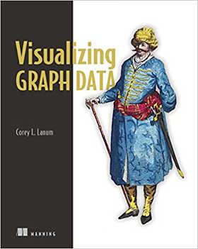
| Visualizing Graph Data |
|
Author: Corey Lanum It's easy to gather data, less easy to work out what the relationships in the data are. This book shows how to display information using graphs. The book starts with an introduction to graphs and data models, followed by a set of case studies illustrating a number of ways that graphing data can be useful. The case studies include intelligence and terrorism; credit card fraud; cyber security; and sales and marketing. Seeing ways that you can see things of interest more clearly in a graph makes the case very strongly for why using graphs is a good idea. Having set the scene for why graphing data is a good idea, Corey Lanum then goes on to show how to visualize your own data. This starts with a chapter on data modelling that discusses what a data model is, how a graph data model differs, and what graph databases are available, specifically discussing Neo4j and Titan. Lanum next explains how to build graph visualizations, discussing what makes a good graph, the importance of keeping your target audience in mind, and how to choose graph elements. Interactive graphs come next, with sensible tips on decluttering charts to make them easier to navigate, and discussion of implementating charts in Gephi and Keylines. There's also a good section on animating charts and designing for mobile touch environments. A chapter on chart organization discusses force-directed layouts as compared to other layouts including circular, hierarchy, radial and 3D.
There's an interesting chapter on using graphs when there's too much data to display, and how you should control which nodes and edges are visible, as well as advice on grouping and combinations. Dynamic graphs to show data over time get a chapter to themselves, with some interesting ideas on how to display data over time. The book ends with a chapter on graphs on maps and working with geographical data. Overall, I liked this book. It's not particularly a 'how to' book, though there is discussion of techniques in Gephi and KeyLines; instead, it's more about how to make your graphs look clean and useful, and why to choose one layout over another to get your point across.To be informed about new articles on I Programmer, sign up for our weekly newsletter, subscribe to the RSS feed and follow us on Twitter, Facebook or Linkedin.
Related Reviews |
|||
| Last Updated ( Saturday, 28 November 2020 ) |

