| Extra Data Visualizations for SharePoint |
| Written by David Conrad | |||
| Tuesday, 12 June 2012 | |||
|
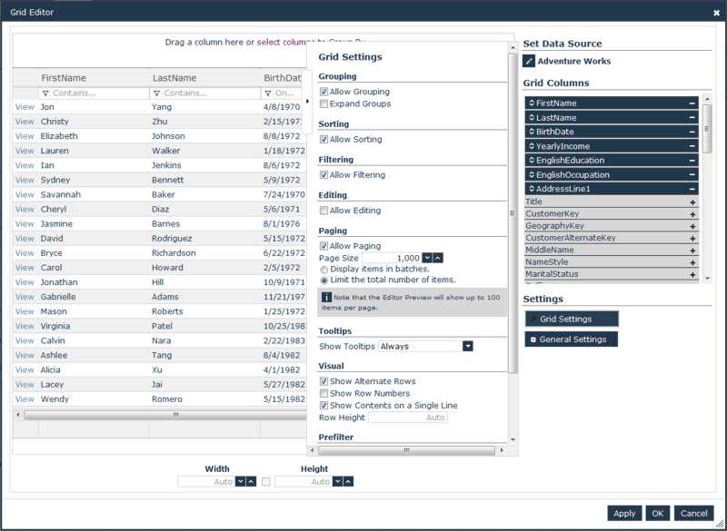
A new grid and some novel map projections have been added to NetAdvantage for SharePoint, Infragistics' set of web parts for creating visualizations from SharePoint data. The major new feature in NetAdvantage for SharePoint 2012 Volume 1 is a tabular Grid web part that gives a great deal of flexibility for working with SharePoint data.
(click to enlarge)
The grid mimics the experience of Microsoft Excel and has the following features:
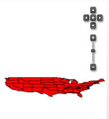
This release also has enhanced map features, specifically support for alternative projections including Balhasart, Berhmann, Lambert, and Mercator. These new features are on top of the existing gauges, charts, and other data visualizations that allow business users to turn SharePoint into a data dashboard for making better business decisions.
The US in Balhasart Projection More InformationNetAdvantage for SharePoint Overiew New features in NetAdvantage for SharePoint 2012 Volume 1 Related Articles
To be informed about new articles on I Programmer, install the I Programmer Toolbar, subscribe to the RSS feed, follow us on, Twitter, Facebook, Google+ or Linkedin, or sign up for our weekly newsletter.

Comments
or email your comment to: comments@i-programmer.info |
|||
| Last Updated ( Tuesday, 12 June 2012 ) |