| Android Adventures - The ConstraintLayout |
| Written by Mike James | ||||||
| Monday, 27 March 2017 | ||||||
Page 3 of 5
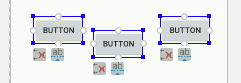
ChainsNew in Android Studio 2.3 is the ability to set bias constraints between components as well as to the parent container. That is you can set pairs of constraints between components that work in the same way as a bias constraint. In doing so you create what is now called a “chain” of components. The reason for introducing chains is to make it easier for ConstraintLayout to create the sort of thing that you would have used LinearLayout for – i.e. lines or columns of components with proportional spacing. Creating a chain is a slightly mysterious process. If you want to create a horizontal chain of say three Buttons the first task is to arrange them roughly into a line:
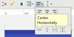
If they aren’t in a reasonable line, the constraints will be applied separately to each component. Select all three by dragging a marque around the three and then select the Center Horizontally button in the toolbar, or use the right click context menu:
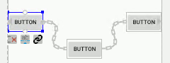
To create a vertical chain you arrange the components in a vertical column, select them all and use the Center Vertically button. Everything works in the same way but rotated by 90 degrees. If everything goes to plan and the components are identified as a potential chain the special constraints will be applied and you will see a chain icon between the inner components:
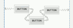
Notice that the default layout for the chain is spread which distributes the views evenly, taking account of margins. There are three alternative layout modes which are selected by clicking on the chain icon that appears when you select a component that is part of a chain. If you click this once the layout changes to spread inside which places the first and last component hard against the container and distributes the others evenly in the space available:
If you click a second time the layout changes to packed which places each component as close together as possible, allowing for margins, and then places them, as a group centered in the container. You can position the group using the bias setting of the first component in the chain. Notice that the bias setting has no effect in the other chain layout modes.
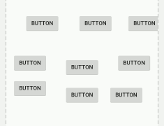
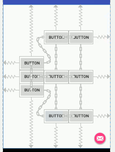
A Chained KeypadTo show how useful chains are let’s implement a keypad of the sort that we used in the calculator project at the end of Chapter 3. It has to be admitted that at the time of writing Android Studio isn’t quite up to making the task very easy – we have to resort to editing the XML. First place nine buttons on the design surface in a rough 3x3 grid:
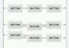
Select each row in turn and use the Center Horizontally command to convert each one into a chain of three buttons:
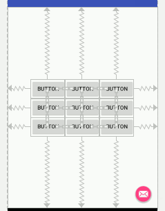
: Then select the three chains and use the Center Vertically command to create the grid:
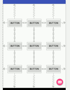
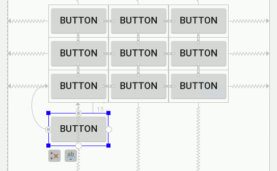
If you want to change the layout to packed, simply select the first button in each row and click the chain icon until you get a packed row:
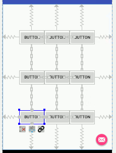
To get a packed column is more difficult because the chain icon only controls the first chain that a component is in. At the time of writing the only way to set packed on the columns is to edit the XML file. The chain style is controlled by the first component in the chain. If you look at the XML for the first button in the first row you will see: app:layout_constraintHorizontal_chainStyle="packed" This is responsible for setting the first row to packed layout. To set the first column to packed you have to change the XML to read: app:layout_constraintHorizontal_chainStyle="packed"
app:layout_constraintVertical_chainStyle="packed"/>
If you do this you will see the first column in packed format:
You have to change the XML for the button at the top of the second row and at the top third row to read: app:layout_constraintVertical_chainStyle="packed"/> If you change the top row button’s XML correctly you should see a packed array of buttons:
The big problem now is that to position the grid of Buttons you have to adjust the bias settings of the first button in each row which sets the horizontal bias for that row and the settings of the first button in each column which sets the vertical bias. There is no single setting that will position the entire grid and this doesn’t make positioning easy. What about adding the tenth Button? It could have been added to the first column but it is just as easy to add it now and set a constraint from the bottom of the last Button in the first column and from the right and left side of the button:
|
||||||
| Last Updated ( Monday, 27 March 2017 ) |