| Android Programming In Kotlin: Bias & Chains |
| Written by Mike James | ||||
| Monday, 08 October 2018 | ||||
Page 2 of 3
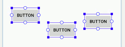
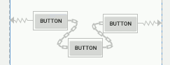
ChainsA recently introduced feature is the ability to set bias constraints between components as well as to the parent container. That is, you can set pairs of constraints between components that work in the same way as a bias constraint. In doing so you create what is now called a “chain” of components. The reason for introducing chains is to make it easier for ConstraintLayout to create the sort of thing that you would have used LinearLayout for, namely lines or columns of components with proportional spacing. Creating a chain is a slightly mysterious process. If you want to create a horizontal chain of say three Buttons the first task is to arrange them roughly into a line:
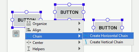
If they aren’t in a reasonable line the constraints will be applied separately to each component. Select all three by dragging a marquee around the three and then right click while all three are selected and use the Chain, Create Horizontal Chain:
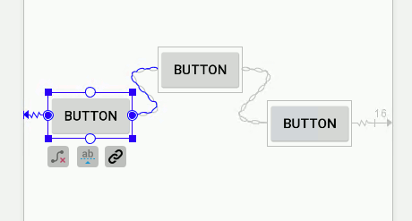
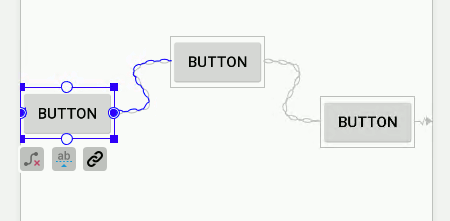
To create a vertical chain you arrange the components in a vertical column, select them all and right click and use the Chain,Create Vertical Chain command. Everything works in the same way but rotated by 90 degrees. If everything goes to plan and the components are identified as a potential chain, the special constraints will be applied and you will see a chain icon between the inner components: Notice that the default layout for the chain is Spread which distributes the views evenly, taking account of margins. There are three alternative layout modes which are selected by clicking on the chain icon that appears when you select a component that is part of a chain. If you click this once the layout changes to Spread Inside, which places the first and last component hard against the container and distributes the others evenly in the space available:
If you click a second time the layout changes to Packed which places each component as close together as possible, allowing for margins, and then places them as a group centered in the container. You can position the group using the bias setting of the first component in the chain. Notice that the bias setting has no effect in the other chain layout modes:
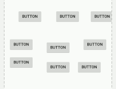
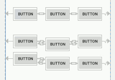
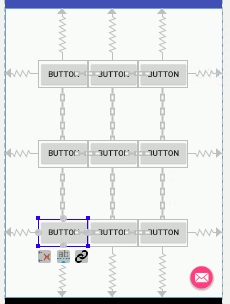
You can set a layout weight using layout_constraintHorizontal_weight and layout_constraintVertical_weight. In spread or spread inside mode this distributes the space in proportion to the weights and mimics the way weights work in a LinearLayout. A Chained KeypadTo show how useful chains are, let’s implement a keypad of the sort that we used in the calculator project at the end of Chapter 3. First place nine buttons on the design surface in a rough 3 by 3 grid: Select each row in turn and use the Chain, Create Horizontal Chain command to convert each one into a chain of three buttons:
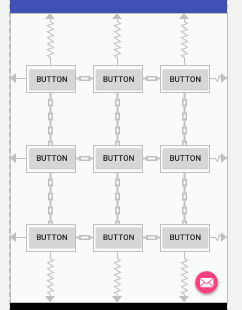
Then select the three chains, i.e. all nine buttons, and use the Chain, Create Vertical Chain command to create the grid: If you want to change the layout to Packed simply select the first button in each row and click the chain icon until you get a packed row:
|
||||
| Last Updated ( Saturday, 13 October 2018 ) |