| Android Adventures - Layouts 2.3 |
| Written by Mike James | |||||||
| Thursday, 19 March 2015 | |||||||
Page 4 of 6
RelativeLayoutThe RelativeLayout is the one that was favored by Android Studio until the ConstraintLayout was introduced. It is still the default layout however. It is a complex and sophisticated Layout component and you might think that you should prefer simpler Layout components if at all possible. For example you can often use a number of LinearLayouts to do the work of a single RelativeLayout. The most commonly quoted rule is that you should try to design your UI using the smallest number of Layouts. In particular, deep nesting of Layouts, i.e. one Layout inside another, slow things down because the system has to dig deep into each layer of Layout and this can take a lot of work. The rule is: Prefer a shallow sophisticated Layout to a deep nest of simpler Layouts. You can usually replace a set of nested LinearLayouts with a RelativeLayout or a ConstraintLayout. For such a capable Layout, RelativeLayout has only a few Layout properties. These fall into two groups:
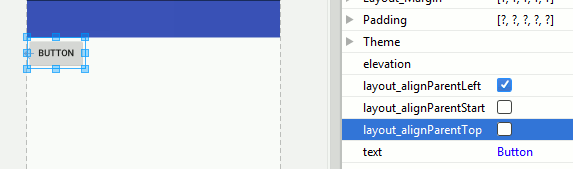
At least one of the controls in the Layout has to be positioned relative to the parent container to give the rest of the Layout a position. However, any number of controls can be positioned relative to the parent container. The RelativeLayout parameters are presented and organized by the Property window slightly differently to the way they are represented as constants in the XML or in code. This description applies to the way Android Studio presents them. Refer to the documentation for the XML or programmatic constants. Edge AlignmentThe principle is that you can specify the alignment of any pair of edges, one in the parent and one in the child. This will move the child control so that its edge lines up with the parent edge, for example, top edge to top edge. If you specify two pairs of edges then you can change the size of the control as well as positioning it. For example, top to top and bottom to bottom makes the child control the same height as the parent. Parent LayoutThe parent layout properties are: alignParent top, left, bottom, right These align the corresponding edge of the control with that of the parent RelativeLayout. For example: setting alignParent to left moves the left side of the control to the left side of the parent.
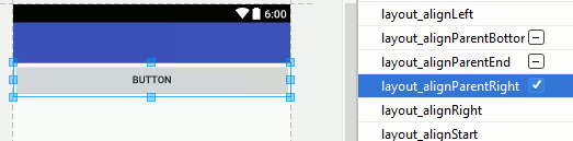
This works without any resizing of the control. If you select two opposing alignments, top and bottom or left and right, then both the edges are moved and the control is resized. For example setting alignParent to left and right produces:
As well as aligning to the edges you can also align to the center of the parent. The centerInParent property can be set to any of both, horizontal, Vertical and it simply centers the control as specified. Component LayoutThe layout designer used to map a confusing set of XML properties that positioned a component relative to another component. The lastes designer no longer performs this simplification. Instead you can either allow the designer to work out how to set position relative to another component or you can work with the properties in the Properties window. The basic idea behind all of the relative positioning properties is that you simply supply the name of the component you want to position relative to. There are a set of properties that you can use to align the same edges on each control:
and
which can be set to the name of the control you want to align with. For example:
sets the righthand edge of the control to align with the righthand edge of button1. Aligning two edges top/bottom and left right changes the size of the control. The
and
properties align the bottom of the control with the top of the referenced control and the bottom with the top of the referenced control respectively. Similarly the
and
properties align the left/right of the control with the right/left side of the refreenced control. FinallThere is also a
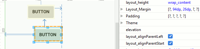
alignment option which aligns the text baseline in the parent and child control. In API 17 a new feature was added to allow layout to take account of a layout direction. In normal use with Layout_Direction set to left-to-right then the start edge is the same as the left edge and the end edge is the same as the right edge. If Layout_Direction is right-to-left then start is right and end is left. For example, you can set startpadding to control the padding on the left or right depending on the layout direction set. All of the left/right properties have a start/end version. Margin OffsetsSo far all we can do is align pairs of edges. How do you specify exact positions relative to another control or the parent? The answer is to use the common pattern of setting the margins of the control. If you align top edges but set a top margin of 10dp on the child then the top of the child control will be 10dp lower than the parent control.
So the edge alignment is used to specify the relative direction of one control to another and the margins set give the exact offset. RelativeLayout And The DesignerWith all of this understood you can now see how the Designer lets you generate a RelativeLayout. As you move a control around the design surface the nearest other control or the parent Layout is selected as the parent to use for positioning, the closest edges are used for alignment and that margin is set to the distance between the parent and child. This works well but it can sometimes be difficult to get the Designer to pick the control or the Layout as you move a control around. You can always use the Properties window to manually set this if it proves too difficult to set interactively. Also notice that if you drag and edge of one control close to alignment with the edge of another control then this will result in just that edge being aligned and the control changes its size. For example if you drag the right side of a control to the right size of the Layout then the width of the control changes. This behaviour can confuse beginners using the designer as it appears to be possible to resize controls by dragging an edge but most of the time the control snaps back to its original size when released. Of course it only resizes when the edge you are dragging lines up with a corresponding edge on another control. It has to be said that the layout designer is not as easy to use with the RelativeLayout as in previous versions of Android Studio. For example it no longer supplies interactive positioning feedback in terms of pixel offsets and it no longer uses a simplified system of layout properites which map onto the real XML properties. These things might change in future versions. if you understand the way that the RelativeLayout works then using the Designer is much easier and indeed using RelativeLayout to create a complex UI is easier |
|||||||
| Last Updated ( Monday, 27 March 2017 ) |