| Windows Phone 7 - the Bing Maps Control |
| Written by Ian Elliot | |||||
| Monday, 27 September 2010 | |||||
Page 3 of 4
PushpinsMoving on from simply panning, zooming and generally controlling the map view it is also possible to add Pushpin markers and more general shapes. The Silverlight map control uses a special Pushpin class and additional classes MapPolygon and MapPolyline, both derived from MapShapeBase, for more general shapes. You can also use MapShapeBase to create your own special shape classes. However you can also place any Silverlight graphic on the map in a way that is almost as easy as the specially supplied objects. Let's start with the Pushpin. First you have to create a Pushpin object: This creates a Pushpin at the specified position. To make the pin display you need to add it to the map object: MyMap.Children.Add(pin);
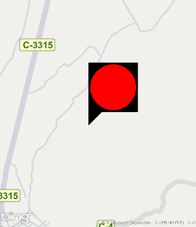
The default Pushpin At this point you might be disappointed with the appearance of the default Pushpin. It may not look impressive but it behaves in a different way to the desktop version and it is much easier to customise. The Pushpin derives from a ContentControl and as such it is a standard Silverlight object and you can set its Content property to whatever you want the control to display. For example: pin.Content = new Ellipse() {
sets the content to a red ellipse. The good news is that the content displays within the Pushpin's top display area which also grows to accommodate it.
Pushpin with content
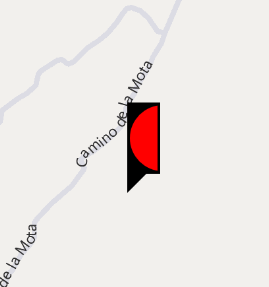
If you do this the ellipse shows without the default pin graphic but it is still cropped to the default size which is 41x35. To allow the entire ellipse to show we simply have to set the size of the pin. Putting this all together:
A custom Pushpin
The default look of the Pushpin is set by a template. Of course you can set the Template property yourself using XAML in the usual way using a Resource. To do this it is easier to add to the Application Resources. Open App.xaml and change it so that the <Application.Resource> section reads: <Application.Resources> You also need to add the attribute:
xmlns:my="clr-namespace:Microsoft.Phone.to the Application tag so that the "my" prefix is defined.
With this resource defined you can set the appearance of a Pushpin dynamically in code using: Of course you can do the same thing in XAML by setting the Template property of any Pushpins you define.
You can also create more complex Pushpins by setting content to a layout grid which in turn is set to contain multiple items - as in the previous example where the Ellipse is nested within a Grid container. Of course you can display text in the same way and you can set a custom bitmap using the Source property. <ASIN:0672333481> <ASIN:1430229284> <ASIN:0470922443> <ASIN:1430233125> |
|||||
| Last Updated ( Tuesday, 28 September 2010 ) |