| Demystifying Pivot Tables |
| Written by Janet Swift | |||
| Friday, 20 August 2010 | |||
Page 1 of 2 Pivot tables are often considered to be complicated and difficult to use - but they correspond to a simple idea and a simple way of working with data. Find out what a pivot table is and how to implement one in WPF. 
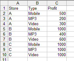
Pivot tables are really useful tools for presenting and exploring data but they have an unfair reputation for being complicated. Indeed many users hear the term "pivot table" but never quite manage to find out what it is all about. The idea, however, is very simple and you probably already have lots of data that are ideal for a pivot table. Let's start with a brief explanation of exactly what the key ideas are. Almost any data that you collect in a spreadsheet or a database is categorised, usually on multiple categories. For example, you might start to keep a spreadsheet of profits made by three stores A, B and C. Then you might well record the data using something like:
Nothing special so far but now suppose that the Profit figures correspond to different types of sales - mobile phones, mp3 players and videos. How would you now record the data? One way is to simply add another column and record the type of each profit:
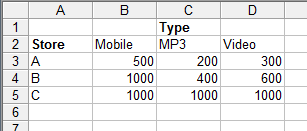
If you think about it for a moment it should be easy to see that an alternative way of entering the same data is to use a column for Store and a Row for Type:
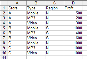
This form of recording the data is often referred to as a cross tabulation or a cross tab for short. The first form is so standard that it hardly has a name but when it is necessary to make a distinction between it and a crosstab it is usually called a one-dimensional form or a flat form. You can see that the cross tab has two dimensions - Store down the column and Type across the rows. So far so good. Now what happens if we add another category? Suppose the stores are in either the north or the south of the sales territory. The flat version of the data is easy enough to generalise - simply add another column:
What about the cross tab or multi-dimensional form? The key is in the "multi-dimensional". In this case we have three categories - Store, Type of profit and Region. You can use these to create a cube with each cell labeled by one category from each of the "dimensions". Of course you can't easily construct a spreadsheet cube and even if you could adding another set of categories would force you to need a four dimensional cube and so on. Even though you can't imagine a 4-D cube, a hypercube, the principles are the same. If you have n categorical measurements, i.e n categorical dimensions, each data value can be imagined to be in a cell labeled by one category value from each of the dimensions. For example, the top row of the spreadsheet:
can be interpreted as saying that the data value or measure Profit=500 should be in a cell in a 3D cube labeled by Store=A, Type=Mobile and Region=N. This sort of interpretation works for any number of dimensions without having to imagine n-dimensional hypercubes.
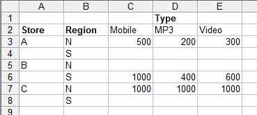
Pivot tables and gridsNow we come to the computer part of the whole idea. A pivot table is a two-dimensional representation of a cross tab cube. There are many ways of arriving at a 2D representation of higher-dimensional data - you can take a slice, you can sum up across a category (aggregate) or you can adopt a tree like diagram approach to displaying the data. All of these fit under the general title of "pivot table". For example you could draw a 2D table from the 3D data above by simply looking at all of the stores in the Northern sector - then you only have Store and Type to tabulate. Instead of fixing the Region to be "N" you could sum across all of its categories to produce a total North plus South profit - once again you would only have Store and Type to tabulate in a 2D table. You can use a range of different aggregation functions to summarise a set of categories that you are not going to plot. For a slice the rule no matter how many dimensions you have is simple: select the two sets of categories you are going to tabulate on and assign a fixed value to the rest. For example, tabulate on Store and Type and set Region to N. For an aggregation the rule is: select two sets of categories you are going to tabulate on and apply the aggregation function to the values generated by allowing the other categories to vary. For example, tabulate on Store and Type and sum across all values of region. The third method of displaying a pivot table depends on there being lots of values which don't occur in the hypercube. For example in the case of Region a store can only be in one region so is Store=A and Region=N then Store A can't have a value in the cells Store=A and Region=S. To display this sort of data you simply pick two categories to be tabulated and then add columns for the sub categories and fill in the data where appropriate. For example, if we tabulate on Store and Type and use Region as the sub category the result is:
You can see that Region category repeats for each of the major column categories, i.e. for each store there is an N and S sub-category only one of which has data in this case. If you look at this sort of table you can see that the rows form a tree structure - A splits into N and S, B splits into N and S and so on. In some cases you can simplify things by omitting the empty branches of the tree. You can also mix approaches; you can fix some sub-categories and aggregate across others while plotting a tree diagram on the remainder. There is one more idea basic to a pivot table and this is the idea of pivoting. This simply refers to the way that you can select a different view of the data simply by selecting which of the two categories are use for tabulation and hence which of the remaining categories are treated as subcategories. In most case the user can select the tabulation categories interactively and watch the table "pivot" to show a new 2D view. Some users refer to the swapping of the rows and columns in a table as a pivot. Its all very clever and very fun. You can play with a pivot table, sorry that should be explore the data with a pivot table for many happy hours. Now it's time to see how to implement a pivot table in your application. <ASIN:1590594320> <ASIN:1119518164> <ASIN:0789743132> <ASIN:1590599209> |
|||
| Last Updated ( Monday, 15 July 2019 ) |