| Charting trends for weight-watching |
| Written by Janet Swift | |||
| Friday, 15 January 2010 | |||
Page 2 of 2

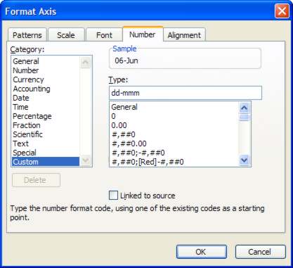
Customising the date displayWe also want to make changes to the x-axis to improve the way the date is displayed. Open the Format Axis box. To do this hover with the mouse on the x-axis in order to see the tip "Value (X) axis" and then double-click.
The dialog opens, click on the Number tab. Although it's a date we are formatting in order to leave out the year value we need to use a custom format, so select Custom on the left and enter "dd-mmm" so into the type box.
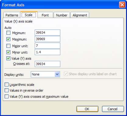
We also want to display one date per week so instead of clicking OK click on the Scale tab in the Format Axis dialog. Box. In order to start the chart on 01-May we need to change the value in Minimum. This is a date serial number which makes it look complicated until you realise that all you have to do is to add 4 to move from the existing starting value of 27-Apr to 01-May – so edit 39930 to 39934. Then type 7 into the Major Unit box to have the tick labels increment by a complete week. Now click OK.
Our chart could now be considered complete but read on if you want to add a trendline.
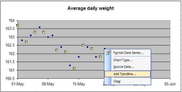
Discerning a trendThe reason for charting this weight data, or scientific data relating to growth, decay and other processes, is to be able to visualise what is happening more easily than by inspecting columns of numbers. This type of data is usually collected to test a hypothesis and so what is important is any pattern or trend in the data. In our example we are hoping to see a steady weight loss which would be indicated by a slope from top left to bottom right. We don’t have to rely on just looking as Excel has the facility to add trendlines to XY charts automatically. It does this by fitting a regression line with a choice of linear, logarithmic, polynomial, power, exponential and moving average. Which of these is relevant depends on the type of data. In most cases, and in this example, a linear trendline is appropriate. One benefit of fitting a trendline is that you can use it to forecast what to expect as long as the trend continues. So in this case where there’s a target weight to aim for, the trendline can be used to discover when this might be achieved. Adding a trendlineThere is already a discernable downward trend in this data - but it would be nice to have it confirmed by adding a trendline. To do this right-click on one of the data points and select Add Trendline from the popup menu that appears.
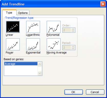
In the Type tab of the dialog that opens ensure than Linear is the highlighted option.
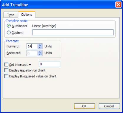
If you want to forecast future weight loss on the basis of the observed data go to the Options tab and put a value, say 14 (2 weeks), in the Forward box and press OK.
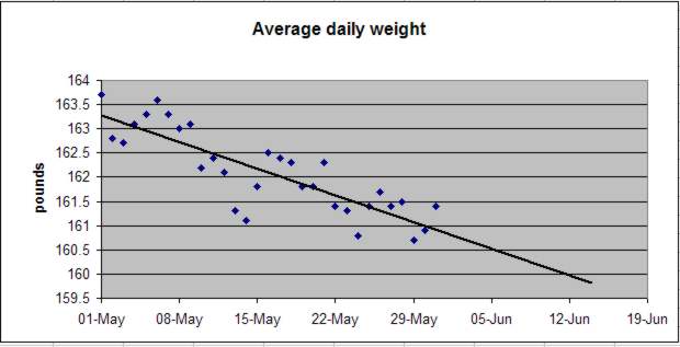
Notice that both the X and Y axes have adjusted to accommodate this trendline. With the help of the trendline we can now forecast that a weight of 160 lbs should be reached in about 2 weeks.
If you want to see the completed spreadsheet download Weight_Chart. For more spreadsheets, including one on Biorhythms see
|
|||
| Last Updated ( Friday, 16 April 2010 ) |