| WinRT JavaScript - The App Bar |
| Written by Ian Elliot | ||||
Page 1 of 3 One of the best examples of how Microsoft is extending the range of controls that you can access from JavaScript and HTML is the app bar. It also happens to be a very useful standard UI element. This article is Chapter 3 of Creating JavaScript/HTML5 Metro Applications. Earlier chapters help you get started with WinRT JavaScipt and its WinControls.
The App BarThe app bar doesn't show by default. The user has to either right click or swipe from the bottom of the screen up. The app bar is also transient in the sense that it normally goes away after the user has selected an option. If you want to you can display the app bar under program control and set it to be sticky. The app bar is a little different from the controls we looked at earlier in that it uses a nested structure to show the controls that should appear when it is displayed. First you need an app bar:
If you try this out you wont see anything as the app bar is empty. You can have multiple app bars in a program but if you attempt this make sure that they display in different locations - see later. To see the app bar you need to put some app AppBarCommand objects between the <div> tags. For example to place three default buttons on the bar you would write:
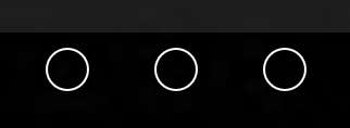
Now if you run the program what you will see, if you right click or swipe upwards is the app bar with three circles for the default buttons at the right hand side:
You can click the buttons but nothing much happens. To create a more useful app bar you need to set some options to control how the buttons look and behave. The first thing to do is to give each button an id so you can refer to it in code. You can also set a suitable icon using the icon property and the AppBarIcon enumeration.You can see all of the icons at AppBarIcon enumeration. You can also set the icon property to the name of a suitable .png file if you want to. To do this use the url function as in :
For example to setupthe first button we might use:
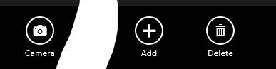
This adds a suitable label and tooltip and sets the icon to be 'add' from the enumeration. The section property needs a little more explanation. If you set section to global then the button displays to the right if you set it to selection then it displays to the left. It is conventional that commands that always apply no matter what the context should be on the right and those that only apply in a given context should be on the left. For example we can now customize the other two buttons:
The result places mybutton3 at the far left and the other two buttons at the right.
Of course you could do the same thing using nothing but code. You would create the objects in the usual way via their constructors and set the options at the same time. The one new feature is that you have to use the app bar's commands property to store an array of AppBarCommand objects. To set the appbar to show all you have to do is:
and to make it sticky
You can also set individual AppBarCommand objects to hide or show using the hideCommands and showCommands methods. |