| An Open Source Dyslexic Font |
| Written by Mike James |
| Tuesday, 02 October 2012 |
|
Programmers seem to be prone to dyslexia, or is it that dyslexics are prone to programming? Whatever the cause, an open source dyslexic font is welcome news. Yes reader, I am dyslexic and I am a programmer - and yes it makes things difficult, especially when I get an attack in the middle of a published article, and variable names are often more variable than they are supposed to be.
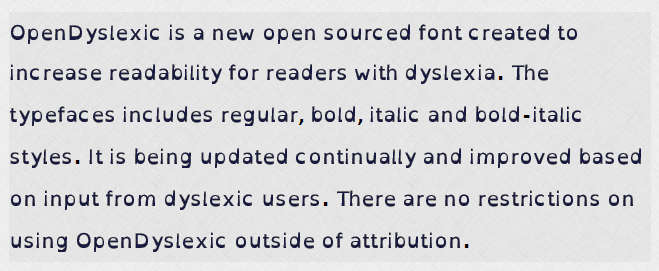
I have been searching for a font that helps with dyslexia for some time, but in all cases there has been some licensing problem or other to deal with. Now we have an open source font that claims to be dyslexic friendly. It is a modification of the Bitstream Vera font to give each letter a "heavy bottom". The font has been made by Abelardo Gonzalez, a New Hampshire-based app designer, who released his designs onto the web at the end of last year. Since then the Creative Commons licensed font has been downloaded more than 12,000 times, which isn't a lot, but it also has been built into a number of applications - WordSmith, the openWeb browser, various e-readers and now Instapaper. The idea of the "heavy bottoms" is that it makes each letter less symmetrical in and adds "gravity" so that you can't rotate the letters. The letter shapes are also supposed to stop flipping e.g. p to q and b to d for example. As the Instapaper blog puts it: "I started looking for a dyslexia-optimized font two years ago, but couldn’t find one that was licensable for apps until now. I’m happy to report that in this update, I added the Open-Dyslexic font by Abelardo Gonzalez. Its bottom-weighted characters are designed to reduce letter-swapping and increase differentiation between similar-looking letters, which improves readability for people with dyslexia. It’s now the bottom-most option in the font list in Instapaper’s text-controls (“aA”) panel." The only problem with this really great idea, and it is difficult to criticize any noble cause, is that it hasn't been tested. There are some personal commendations from dyslexics on the site and there is a plan for a specialist school to test the font in the future but at the moment you have to look at it and decide for yourself if it works.
For me it doesn't seem to. The heavy bottoms remind me of a failing old mechanical typewriter where the tops of the letters are fading out because of broken mechanism or drying out ribbon. Overall I don't find the effect pleasing or easy on the eye - but I do think that the heavy bottoms add an underlined effect that makes it easier to follow the line - but there are other simpler ways of achieving this result, like short line lengths. Overall, it was a relief to get back to a standard font and certainly wouldn't want to use the dyslexic font for coding. But this is a personal opinion and dyslexia is as varied a problem as you can find. The best thing is to try it out. For the future I hope there are some hard statistical facts we can quote on how good, or not, the font actually is.
More InformationRelated ArticlesOpen Source Font Designed For Code
Comments
or email your comment to: comments@i-programmer.info
To be informed about new articles on I Programmer, install the I Programmer Toolbar, subscribe to the RSS feed, follow us on, Twitter, Facebook, Google+ or Linkedin, or sign up for our weekly newsletter.
|
| Last Updated ( Thursday, 04 October 2012 ) |


