| Flat UI Is Slower! |
| Written by Mike James | |||
| Wednesday, 06 September 2017 | |||
|
The whole world is flat. The flat UI is about the only design you can use and expect respect. But old-fashioned 3D non-flat UIs are faster and this has now been reasonably demonstrated by research from the Nielson Norman Group. There was a time when all UIs were flat because we didn't have the computing power to do anything else. Then we did and buttons acquired drop shadows and appeared to be pressed when you clicked them. Of course the way of the world is to reject what we have and so the flat UI was born. Some of us liked it but a surprising number of us, including me, didn't. While I agree that gratuitous skeuomorphy is a waste of space and computing power, the best UI has just enough to make it more usable and certainly understandable. Now we have research that focuses on the way clickability signifiers were downplayed as a part of flat design. A clickability signifier is something that serves to mark out a UI feature that can be clicked to make something happen - underlined text, or a 3D button.
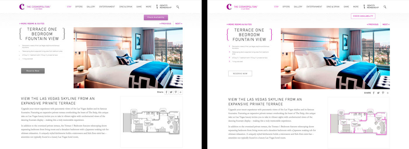
Flat layout on right. You can read the full details of the research in the report, but essentially a set of web pages, nine in all, with and without signifiers, were compared using eye tracking hardware. The statistically significant results were:
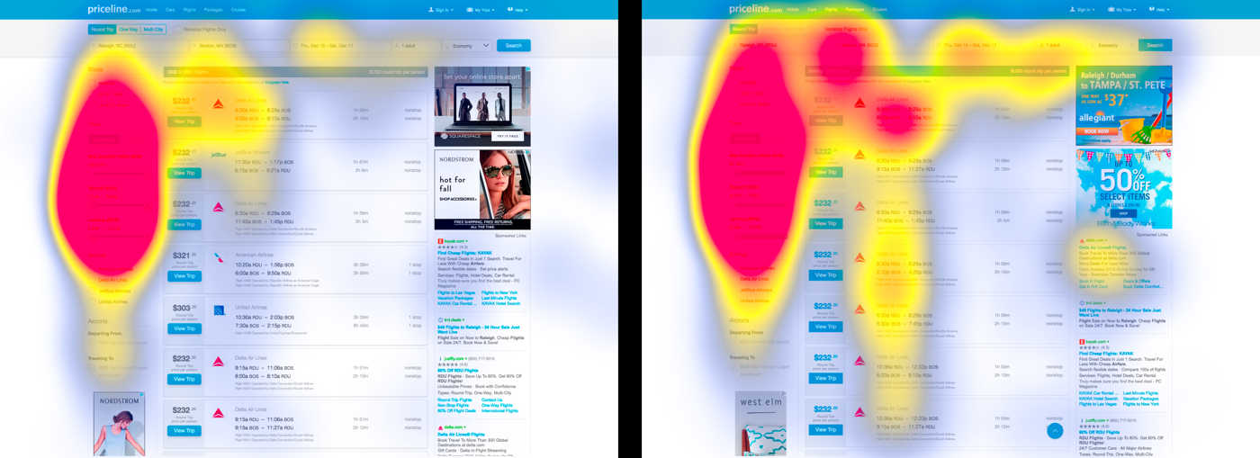
In case you are thinking more time on the page means more engagement and so is good you need to read: "This means that, when looking at a design with weak signifiers, users spent more time looking at the page, and they had to look at more elements on the page. Since this experiment used targeted findability tasks, more time and effort spent looking around the page are not good. These findings don’t mean that users were more “engaged” with the pages. Instead, they suggest that participants struggled to locate the element they wanted, or weren’t confident when they first saw it." Put simply its harder to find the button on a typical flat page than on a page that uses strong signifiers like 3D buttons. Using eye tracking of where the user looked the most, heat maps were generated the two types of page. Six out of 9 of the pairs had different gaze patterns. "The weak-signifier versions of the pages resulted in a broader distribution of fixations across the page: people had to look around more. This result reinforced our findings that weak-signifier pages required more fixations and more time than strong-signifier ones."
Flat layout on right. This now becomes almost common sense - if you don't make the active elements stand out on the page then the users have to spend more time looking for them. On the other hand, the flat UI enthusiasts would say that making active elements stand out in this way spoils the unity and overall look of the page. To make the point even more strongly: Designs with weak clickability signifiers waste users’ time: people need to look at more UI elements and spend more time on the page, as captured by heatmaps, average counts of fixations, and average task time. These findings all suggest that with weak signifiers, users are getting less of that feeling of empowerment and decisiveness. They’re experiencing click uncertainty. Click uncertainty - I like it! And it gets me off the hook for all that time I have spent clicking on what I thought were links but nothing happened. If you are a flat UI supporter then it isn't all bad news, I'm sorry to say. "These findings also confirm that flat or flat-ish designs can work better in certain conditions than others. As we saw in this experiment, the potential negative consequences of weak signifiers are diminished when the site has a low information density, traditional or consistent layout, and places important interactive elements where they stand out from surrounding elements." The suggestion is that to make a real difference you need all three to draw your users attention to the active elements on the page. My only question is, has it been long enough for the flat design to have become the status quo that we can rebel against? If so I have this really good idea - let's implement non-flat designs with some stylish skeuomorphism.
More InformationFlat UI Elements Attract Less Attention and Cause Uncertainty Related Articles
To be informed about new articles on I Programmer, sign up for our weekly newsletter, subscribe to the RSS feed and follow us on Facebook or Linkedin.
Comments
or email your comment to: comments@i-programmer.info
|
|||
| Last Updated ( Wednesday, 06 September 2017 ) |


