|
Page 1 of 3 Layouts are containers for other components. In modern Android you only need the constraint layout but there are others. Here's how to work with them in Kotlin, an extract from my published book Android Programming in Kotlin: Starting With An App.
Android Programming In Kotlin
Starting with an App
Covers Android Studio 3 and Constraint Layout.
Is now available as a print book:
Buy from: Amazon
Contents
- Getting Started With Android Studio 3
- The Activity And The UI
Extract: Activity & UI
- Building The UI and a Calculator App
Extract: A First App
- Android Events
- Basic Controls
Extract Basic Controls
Extract More Controls ***NEW!
- Layout Containers
Extract Layouts - LinearLayout
- The ConstraintLayout
Extract Bias & Chains
- Programming The UI
Extract Programming the UI
Extract Layouts and Autonaming Components
- Menus & The Action Bar
- Menus, Context & Popup
- Resources
Extract Conditional Resources
- Beginning Bitmap Graphics
Extract Animation
- Staying Alive! Lifecycle & State
Extract State Managment
- Spinners
- Pickers
- ListView And Adapters
-
Android The Kotlin Way
If you are interested in creating custom template also see:
Custom Projects In Android Studio

The choice of Layout is vital to an Android UI. The Layout is what allows you to position and generally arrange other components. A good understanding of what is on offer in each of the available Layouts can make the difference between an easy and a difficult UI, from both the point of view of the programmer and the user. This is especially the case if you want to support a range of devices.
All of the classes and objects that make up the Android UI are derived from the same base class, the View. That is, a Button is a View and so are the Layout classes. However, Layouts seem to behave in very different ways to the simple Button and this raises the question what exactly is a Layout?
Understanding Layouts
A Layout is a container for other View-derived objects. When the Layout is asked to render itself, it renders all of the View objects it contains and arranges them inside the area of the display it occupies.
The default Layout used by Android Studio is the ConstraintLayout and we have already looked at using it in earlier chapters, but it is not the only Layout you can use with the Layout Editor.
There are six currently supported Layouts:
-
ConstraintLayout
-
GridLayout
-
FrameLayout
-
LinearLayout
-
RelativeLayout
-
TableLayout
The ConstraintLayout was new in Android Studio 2.2. It is currently the recommended layout to use, and it is the default in Android Studio 3 and later. It can be thought of as a development on the RelativeLayout. In principle, it can be used to create any layout that you can implement using a combination of the other layouts. It is claimed that ConstraintLayout based UIs are easier to construct and faster because they are "flat" i.e. do not use multiple layouts nested inside one another.
Android Studio really doesn't want you to use any layout other than ConstraintLayout as the initial container and so it doesn't let you delete the default layout. It will let you replace a RelativeLayout in an existing project with a ConstraintLayout, but you cannot delete or replace it by any other layout. The reason is that replacing one layout by another is difficult because of all of the changes in the supported properties.
You can edit the XML file directly to replace one layout by another, but you will have to re-edit all of the layout properties. You can replace an empty layout by another by editing the XML file and this is currently the only way to do the job.
Despite the fact that ConstraintLayout is the recommended layout to use there are still many Android projects that use the original layouts and some programmers simply don’t like the ConstraintLayout. Hence it is worth knowing how the simpler layouts work.
Among the original layouts, RelativeLayout and LinearLayout are the most used, with FrameLayout coming a distant third. The final two, TableLayout and GridLayout, are suitable for specialized types of UI and in Android Studio 3 are more or less unsupported in the Layout Editor so you have to work directly with their properties. For this reason they are best avoided.
Before looking at these alternatives and how to work with them, it is worth getting to grips with the basic ideas of layouts and the principles they share in common. Then we will look at the Frame, Linear and Relative layouts because they are still important. ConstraintLayout, however, is so important because it is the preferred layout type for the future that it gets a chapter all to itself.
Layout Properties
Mostly you tend to think of the properties that are relevant to a control as belonging to the control, but a layout can do its job in many ways and requires the control to have lots of very specific properties to determine how it is positioned. In other words, the properties that a control needs to work with a layout depend on the layout chosen and this makes things difficult to organize.
The simplest but unworkable way of implementing this would be to insist that every control implemented every property used by every layout, even the ones not currently being used. This is clearly inefficient.
The solution to the problem actually used is that each layout defines a nested class, derived from LayoutParams, that has all of the properties it needs the control to define. The control that is to be placed inside the layout creates an instance of the appropriate LayoutParams class and so varies the parameters it has access to depending on the layout container it finds itself in.
That is, instead of defining every possible property that any layout could want, a UI component that can be placed in a layout uses the appropriate LayoutParams class to "import" the properties it needs for the layout it finds itself in. This means that a control has two types of property – its own and those that it gets from LayoutParams.
Thus in the Layout Editor where the properties are represented by XML attributes a control's attributes are shown in two groups:
You can tell Layout attributes because they are of the form layout_name in the XML file. You can see them in the Attributes window in the Layout Editor:
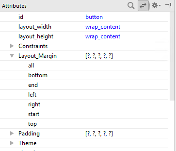
So in the screen dump the layout_margin attributes are supplied by the ConstraintLayout.LayoutParams object, but the Padding attribute is something that the Button supports. In other words, which layout attributes you see depends on what sort of layout the control is, but the other attributes belong to the control and are always listed. It is also worth knowing at this early stage that the Layout Editor often presents a simplified set of layout attributes which it then maps onto a larger and more confusing set of layout_ attributes in the XML.
|