| Android Programming In Kotlin: Layouts |
| Written by Mike James | ||||
| Monday, 18 November 2019 | ||||
Page 2 of 3
Width and HeightThe exact set of Layout attributes that you see depends on the Layout you use. However, there are two that all Layouts support:
You might think that the width and height of a control were attributes that should belong to a control, but here things are more subtle. A control doesn't necessarily have a fixed size. It can, for example, ask the Layout to give it as much space as possible, in which case the Layout sets the size of the control. This is the reason why controls have layout_width and layout_height and not just width and height. You can set these properties to any one of three possible values:
If you use the mouse to drag the frame of a control in the Layout Editor then what happens depends on the control and the Layout. In most cases the default set by the Layout Editor is wrap_content and it will ignore any attempts you make to interactively size a control. Indeed, in most cases trying to interactively resize a control doesn't change the layout_width or layout_height properties. However, depending on the Layout in use you might appear to change the size of the control due to the setting of other layout properties. More of this when we deal with particular Layout types. The point is that the layout_width and layout_height are not necessarily the only attributes that control the final displayed size of a control. One thing is fairly certain, if you want to set a fixed size for a control then you need to type the values into the Property window. UnitsIf you are going to enter a fixed size or a location you need to know how to do it. Android supports six units but only two, both pixel-based units, are used routinely:
The unit that it is most tempting to use when you first start creating an app is px, the pixel, because you generally have one testing device in mind with a particular screen size and resolution. This is not a good idea if you want your app to look roughly the same as screen resolution changes. For this you need the density-independent unit, dp, because it adjusts for the screen resolution. If the device has a screen with 160 pixels per inch then 1dp is the same as 1px. If the number of pixels per inch changes then dp to px changes in the same ratio. For example, at 320 pixels per inch 1dp is the same as 2px.
Notice that this does not compensate for the screen size. If you keep the number of pixels fixed and double the resolution then the screen size halves. A control on the screen specified in px would then display at half its original size. A control specified in dp would display at its original size but take up twice the screen real-estate.
If you specify sizes in dp then your layout will look the same on a 7-inch tablet, no matter what resolution it has. As well as pixel-based measures there are also three real world units:
All three work in terms of the size of the screen, and the number of pixels a control uses is related to the screen resolution. If the screen has 160 pixels per inch then 1/160 in=1 px and so on. Notice that once again these units protect you against resolution changes, but not changes to the actual screen size. Your button may be 1 inch across on all devices, but how much of the screen this uses up depends on the size of the screen the device has. The danger in using real world units is that you might well specify a fractional number of pixels and end up with an untidy looking display. The final unit is also related to pixels but is tied to the user's font size preference:
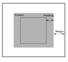
This works like the dp unit in that it is scaled with the device's resolution but it is also scaled by the user’s default font size preference. If the user sets a larger font size preference then all sp values are scaled up to match. Which unit should you use? The simple answer is that you should use dp unless you have a good reason not to, because this at least means that if you have tested your UI on a device of size x it should work reasonably on all devices of size x, no matter what the resolution. Android Studio defaults to working in dp whenever you enter a value without a unit or when you interactively size or move a control. A Control is Just a BoxAs far as a Layout is concerned, a control is just a rectangle. Its size is given by layout_width and layout_height and these can be set by the control or, more often, by the Layout. Once the Layout knows the size of the control it can position it according to the rules you have established using the Layout's properties. If you want to know the position that a control has been assigned then you can use its Top and Left properties. This gives you the position of the top left-hand corner of the control's rectangle. You can work out where the other corners are by using Width and Height properties, but to make things easier there is also Right and Bottom property. Notice that the position of the top left-hand corner of the rectangle is always relative to the Layout it is in. That is, the position is not an absolute screen position. It is also worth knowing that controls also support padding, dead-space inside the control. This is space left between the outside edge and the content. In addition some, but not all, layouts support margins, dead-space outside a control that can be used to add space between controls:
Notice that padding is a property of the control and margin is a layout property. You can set each margin or padding on the left, right, top or bottom individually or specify a single value to be used for all of them. In theory, padding is used to put space around the content of a control, but it can also be used simply to make the control bigger when its dimensions are set to wrap its contents. For example, the Button on the left has zero padding and the one on the right has a padding of 30dp all round: Similarly, margins are used to put space around a control, but they can be used to position one control relative to another or to its container. This is how RelativeLayout and ConstraintLayout work. In book but not in this extract:
|
||||
| Last Updated ( Monday, 18 November 2019 ) |