| Android Programming In Kotlin: Layouts |
| Written by Mike James | ||||
| Monday, 18 November 2019 | ||||
Page 3 of 3
LinearLayoutThe next layout we need to consider is the LinearLayout. This is a simple layout that can be used to do a great deal of the basic work of organizing a UI. In fact once you start using LinearLayout, it tends to be the one you think of using far too often. You can use a LinearLayout as the base Layout, replacing the default ConstraintLayout that Android Studio provides, or you can place a LinearLayout within the ConstraintLayout. In Android Studio LinearLayout occurs twice in the Palette – once as a vertical and once as a horizontal LinearLayout. The difference, however, is just the setting of the orientation property to horizontal or vertical. In other words, you can swap a horizontal and vertical linear layout with a simple property change. The horizontal LinearLayout acts as a row container and a vertical LinearLayout acts as a column container. You can use nested LinearLayouts to build up something that looks like a table, but if this gets very complicated it is better to use ConstraintLayout. Nesting layouts like this is also inefficient as the rendering engine has to compute the layout multiple times to get it right. The advice is to use a ConstraintLayout and avoid nesting. If you place a LinearLayout on the ConstraintLayout then you can position it like any other control. If you then place other controls inside it then they will stack up horizontally to form a row or vertically to form a column. This sounds easy but there are lots of ways to use a LinearLayout. For example, if you put a horizontal and a vertical LinearLayout in the ConstraintLayout then how they behave depends on what you set their layout_width and layout_height to. If you set it to wrap_content then the two Layouts act like a horizontal and vertical panel of controls, i.e. you can move all of the controls as a block:
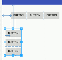
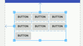
It can be very difficult to be sure what you are dragging in the Layout Editor as it is easy to pick up one of the Buttons rather than the layout. Make use of the Component Tree window to select the layout and to make sure that the Buttons are in the layout you think they are. Things get more interesting when you nest one LinearLayout inside another to create a table. For example, you can create a calculator style keypad by nesting three horizontal LinearLayouts inside a single vertical LinearLayout. That is, place a vertical LinearLayout on the screen and then place three horizontal LinearLayouts within it. Within each horizontal LinearLayout place three buttons. If you have difficulty doing this, use the Component Tree to make sure that the components are correctly nested. Make sure that you set the layout_width and layout_height to wrap_content, otherwise the LinearLayouts will overlap:
This is easier to arrange than using the ConstraintLayout. The final Button is just placed into the vertical LinearLayout and it forms a row all of its own.
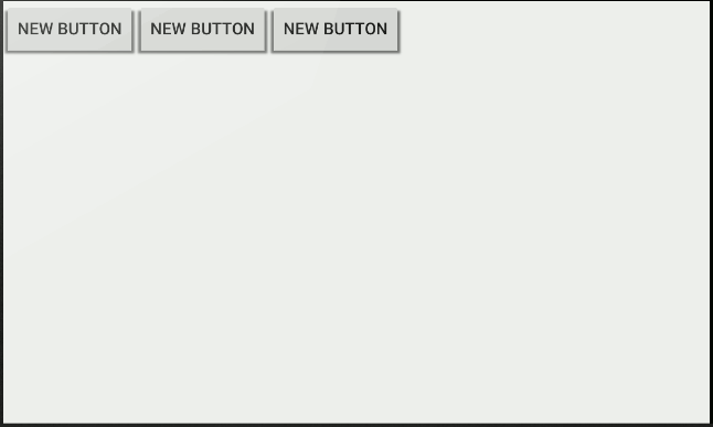
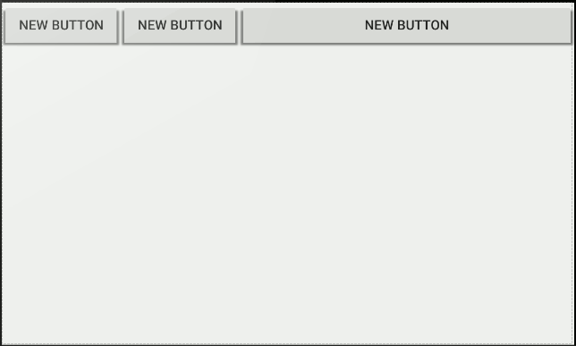
Layout_weightThere's one last mystery of the LinearLayout to discuss, layout_weight, a layout property that only the LinearLayout supports. If you assign a layout_weight to any of the controls in a LinearLayout then the controls are adjusted in size to fill any unused space in proportion to their weights. The really important part of this description is "unused space". What happens is that Android first computes the layout ignoring any weight assignments. This means that the controls are set to the sizes you specified. Next the system determines what space remains unused in the containing LinearLayout. This is then distributed between the controls that have non-zero values of layout_weight in proportion to their weights. For example, suppose we have a horizontal LinearLayout with three Buttons all set to wrap_content. The screen has been rotated to provide a lot of unused space for the example:
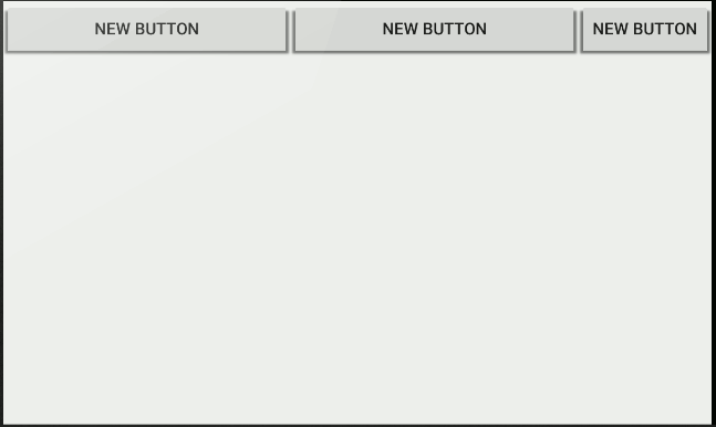
You can see thatthere is a lot of unused space over to the right. If we now set the first Button's layout_weight to 1 it will be allocated all of that unused space:
If you now set the second Button's layout_weight to 1 then the unused space will be shared between the first two Buttons equally:
You can guess what would happen if we now set the third Button's layout_weight to 1, the space would be shared equally and all three buttons would be the same size. If, however, the first button was given a weight of 2 then the unused space would be shared out in the ratio 2:1:1 and so on. More interestingly what do you think would happen if you assigned a fixed width to the third Button? The answer is simple. If the third Button's layout_weight is zero then it is set to the width specified and the other two buttons get the unused space. For example setting the third Button to 350dp gives:
However, if the third button has a layout_weight set then it will probably change its width because it gets a share of the unused space just like the other buttons. In other words, when you set a non-zero layout_weight a control can change its size even though you have set a specific size for it. This leads to the idea of "measured size" and "actual size". In the case of the third Button its measured size is 350dp but if its layout_weight is non-zero then its actual size on the screen will be different – it will be allocated some of the unused space. When you are working with components in code the Width and Height properties will give you the actual width and height of the control. The MeasuredWidth and MeasuredHeight properties will give you the measured width and height before any adjustment by the Layout has been performed. Finally, it is worth pointing out that if you want to be sure that the three Buttons are the same size you have to set their widths to 0dp and weight to 1 (or the same value). Why is this necessary? When you set the widths to zero all of the space is unused and the system will divided it equally between each one. You can also set their widths to some constant minimum value and then let the weight mechanism share out the unused space. In book but not in this extract:
Summary
Android Programming In Kotlin
|
||||
| Last Updated ( Monday, 18 November 2019 ) |