| WPF Data Charting |
| Written by David Conrad | |||||||
| Tuesday, 13 July 2010 | |||||||
Page 3 of 3
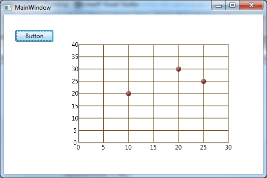
Scaling the axesThe resulting chart is fairly good but the default axes are scaled to just fit the data. A better presentation is obtained by specifying max and min values for both x and y: NumericXAxis myXAxis = new NumericXAxis() With these changes the result is a very acceptable first attempt at a chart:
A XAML alternativeOf course you can achieve the same results by specifying the axes and series using nothing but XAML. All you have to do is write the XAML tags that create the same objects. The only complication is that as the data set is defined in code we have to set the DataContext in code as well - it is difficult to refer to object created in code within XAML. We start off with the opening XAML tag for the component itself: <ig:XamDataChart HorizontalAlignment="Left" Next we need to define the axes within the Axes property of the control: <ig:XamDataChart.Axes> Finally we define the series and close the opening tag: <ig:XamDataChart.Series> Now all we have to do in code is set the DataContext and the Series ItemSource: xamDataChart1.DataContext = data; The result is the same as the previous code-generated chart. Of course you can generate the data in XAML as well as the chart, but this isn't particularly realistic. Most data charting projects work best with some XAML and some code. You can also create charts using Expression Blend. But the point is that now you understand the way data interacts with the DataChart component you can quickly graduate to the sort of impressive examples you can see on the Infragistics website, no matter what method you use.

<ASIN:0672331195> <ASIN:1430231629> <ASIN:0470502266><ASIN:0596159838> |
|||||||
| Last Updated ( Thursday, 19 August 2010 ) |