| Innovations for richer UX |
| Tuesday, 14 December 2010 | |||
|
A Motion Framework API added to Infragistics Siverlight and WPF data charting products enables developers to animate business intelligence data. Additional features in Quince help teams to review, understand and collaborate on projects.

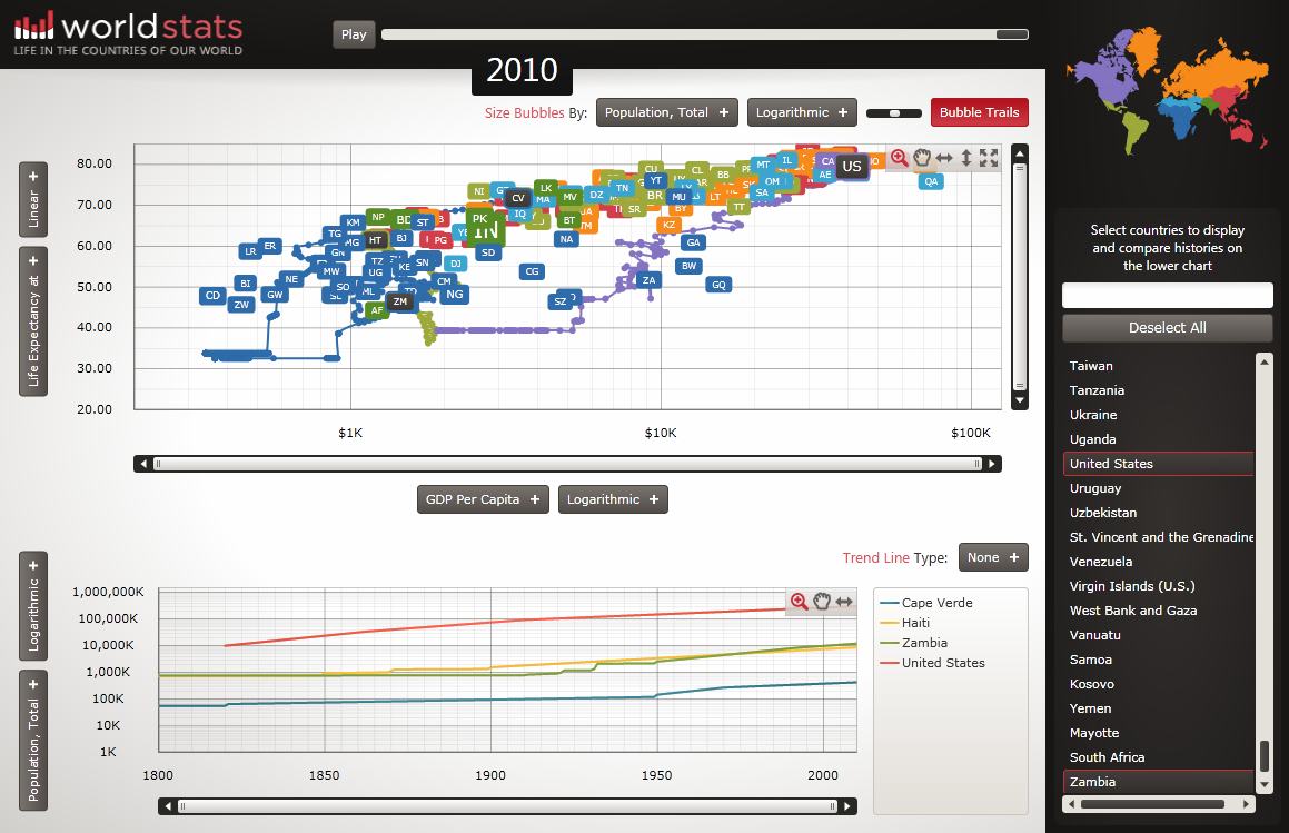
A new API has been integrated into Infragistics xamDataChart, a charting component for handling high volumes of data and available in both Infragistics Silverlight and WPF Data Visualization Data Chart Control that are also part of the NetAdvantage Ultimate toolset. The Motion Framework API enables XAML (Silverlight and WPF) developers to visually animate business intelligence data over time giving the end user richer insight into their data through an interactive and engaging experience. To show off the new capabilities on offer two new reference applications have been provided to demonstrate how to program data visualizations with the Motion Framework, geospatial maps and data charts. The World Maps showcase application displays geospatial data and charts using Windows Azure cloud services and while the World Stats one allows you to delve into an animated user experience that lets you explore global population growth, per-capita wealth, improvements in infant mortality, and other key statistics. You have to try it to see how effective it is. As you watch the "cloud" of data points move you can't help but wonder what causes particular types of behavior, why did Kuwait suddenly jump in per capita wealth? More formally, it helps generate hypotheses and generally investigate the data.
Click for larger image
New features have also been added to Quince, Infragistics' design review tool targetted at teams collaborating on projects. The new and enhanced features such as Design Boards, SharePoint Integration, and Pattern Sharing between Libraries, help both interaction and visual design in building the best user experience. Further reading Ultimate .NET toolset from Infragistics
|
|||
| Last Updated ( Tuesday, 14 December 2010 ) |