| Using Predix UI Web Components |
| Written by Kay Ewbank | |||
| Monday, 23 October 2017 | |||
|
The Predix Design System is being used to build web applications for the Industrial Internet that is built on the Predix platform by using an increasing library of UI web components that were created using Polymer.
The Predix Design System provides a common visual and interactive environment for developing Predix-based apps. It gives a consistent approach to using color, material, typography, page structure, navigation and motion, and comes with a set of tools including templates, design principles, usage guides and stencils. The system is made up of three parts:
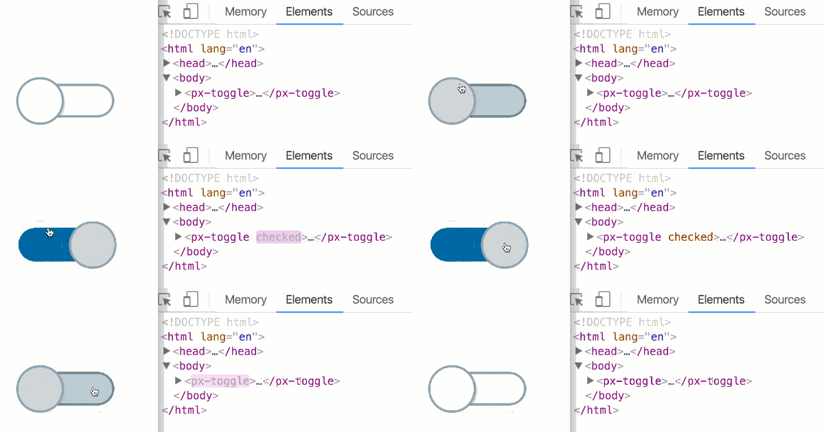
Predix UIPredix UI is distributed as part of the Predix platform and can be used to build user interfaces for industrial Internet web applications. The web components are its core elements and are modules that provide more elaborate capabilities like data visualizations, tables and calendars. They are a set of user interface building blocks based on the W3C web components standard that can be assembled together to build an application. Alongside the 'basic' components for UI elements such as dropdown menus, data tables and tabs, there are a number of more specialized D3-based data visualization charting components designed specifically for industrial internet use cases. The components look and work like standard HTML tags. You configure each component with attributes (like the `src` in <img src=”picture.jpg”/>) and listen for updates through DOM events.
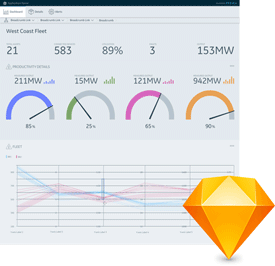
Another key part of the system is the Design Starter Kit. This, along with the design guidelines, provide the tools to start the design process off in the right direction. The Starter Kit is a Sketch file that contains the most common layouts and components and themes in a flexible, ready to use format. Predix UI code is distributed on GitHub as part of the Predix platform, and there are interactive demos and documentation for the Predix UI components on the Predix UI website. The Predix team says that if you need a component, chart or behavior that is not available in the Predix Design System, let them know and they'll work with you to get it prioritized. Developers are also encouraged to contribute shareable web components back to the Predix UI library.
Built with PolymerThe Predix UI web components were created using Polymer – a lightweight JavaScript library built by Google that simplifies the steps to build reusable web components and use them in applications. Polymer provides a lightweight data system, some data binding syntax, and some template features. The thinking behind the choice of Polymer to build the Predix UI components started with the fact that Polymer makes it easy to build custom reusable components as part of the HTML specification. The Predix developers say that: "Polymer isn’t an opinionated framework — it just helps teams use features that are present in all modern web browsers." Polymer also provides “Shadow DOM” which allows JavaScript, CSS and templates to be encapsulated. Every web component has a “Shadow DOM” wrapped inside <template> tags. These hide the inner complex coding structure and scope from the app that uses the component, meaning that the component’s design is not affected by the CSS used in the app, and that the component’s CSS does not leak out and affect the app’s design. It also means components are more likely to be used consistently, and the implementation details of components are hidden from app developers. Each Polymer component starts with a <dom-module> tag with a unique id, and a Polymer constructor function that uses the same unique id. The id serves as the identity of each Polymer component, allowing it to be used in any HTML file. For example, a component with the id “px-component” can be used with the tag <px-component>. Polymer is supported by all modern browsers. The webcomponent.js polyfill should be loaded in apps using Polymer components to ensure full backwards compatibility with browsers that do not have native web components implemented, such as Internet Explorer 11. Polymer components allow for data-binding with a syntax similar to Angular. Components can be configured and updated with new data by changing their attributes. Internal changes and other information coming out of the component is notified out to the application through native DOM events. Polymer also supports HTML imports, used to import components and other dependencies. The Polymer ecosystem includes a “vulcanization” tool which minifies all application components into a single HTML file, speeding up loading and parsing on HTTP1 connections. The Predix UI components are designed to be framework agnostic, so avoiding the need for developers to learn new frameworks or libraries. The Predix Design System has been used successfully with popular UI frameworks like Angular, React, and also without a JS Framework. Predix Design In ActionThe GE Predix Advanced Engagement team uses the Predix Web App Starter (formerly known as the Seed) in order to use the Predix UI web components without JS Framework in order to quickly build good looking demos and applications, while the Polymer web components created are in the Predix UI library. There's also a Predix UI component generator that can be used to create new Polymer components. Another GE team who create intelligent web applications for industrial clients starts from the Predix UI component catalog when building its customers' application frontend: "We've used the Predix UI components in Angular applications, pure Polymer applications and in React POC applications. The Predix UI components are framework agnostic" according to Tyson Daugherty, a Senior Software Engineer in GE Digital. The team has also worked with the Predix Design System team to contribute new components to the Predix UI catalog and to enhance existing PX components. The key feature of the Predix Design System is its increasing collection of components that provide UI building blocks. These can be used to build user interfaces for Industrial Internet web applications, and they work without tying you to a particular framework.
More Information Related ArticlesBuilding A Digital Twin With Predix
To be informed about new articles on I Programmer, sign up for our weekly newsletter, subscribe to the RSS feed and follow us on Facebook or Linkedin.
Comments
or email your comment to: comments@i-programmer.info |


