| Android Programming In Kotlin: More Controls |
| Written by Mike James | |||
| Monday, 27 January 2020 | |||
Page 2 of 2
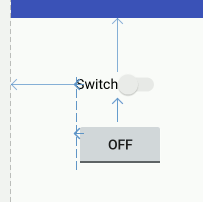
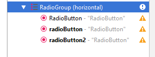
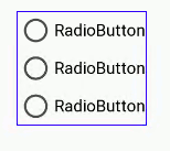
Switches and Toggle buttonsSwitches and Toggle buttons are just CheckBoxes in another format. They store one of two states and they change state when the user clicks on them, just like a CheckBox: You can check the state of a Switch/Toggle button using the isChecked method and you can use its onClick event to monitor when its state changes. The only real difference is that you can use the textOn and textOff to set what is displayed when the switch/toggle is on or off. Radio ButtonsThe final "simple" input control is the RadioButton. This works like a CheckBox in that it can be in one of two states, but the big difference is that a set of RadioButtons works in a group and only one of them can be selected at a time. The reason for the term "radio button" is that, in the early days of electronics, car radios had mechanical tuning buttons arranged in a line which let the driver quickly select a station by pressing a button. When you pressed a new button the current button popped up so that only one button was pressed at any given moment, making sure that you only listened to one station at a time. The only complication in using RadioButtons is making sure you group them together correctly. To do this we have to make use of a RadioGroup container which is used to hold all of the buttons that work together. There are a number of different containers used to group controls, but the most basic of these is the RadioGroup. Using Android Studio you can create a group of RadioButtons by first placing a RadioGroup container on the design surface and then placing as many RadioButtons inside the container as you require. If a group of RadioButtons doesn't work as you expect, the chances are that not all the buttons are within the RadioGroup. The easiest way to check, create and edit a group of RadioButtons is to use the Component Tree window where you will be able to see exactly how they are nested. You can also add RadioButtons to the container by dragging to the Component Tree window.
All the RadioButtons within a RadioGroup automatically work so that only one button can be selected at a time and you don't have to do any extra work to implement this behavior. To find out which button is selected you can use the isChecked method as in the case of the CheckBox. In fact you can work with a set of RadioButtons in exactly the same way as a set of CheckBoxes, with the only differences being the use of the RadioGroup and the fact that only one button can be selected at any one time.
You can use the onClick event to detect when any button has been modified and the setChecked or the toggle methods to modify the state of a button. Summary
To be informed about new articles on I Programmer, sign up for our weekly newsletter, subscribe to the RSS feed and follow us on Twitter, Facebook or Linkedin.
Comments
or email your comment to: comments@i-programmer.info <ASIN:1871962544> <ASIN:1871962536> <ASIN:1871962587> <ASIN:1871962439>
|
|||
| Last Updated ( Monday, 27 January 2020 ) |