| Advanced Investment Analysis |
| Written by Janet Swift | |||||
Page 2 of 4
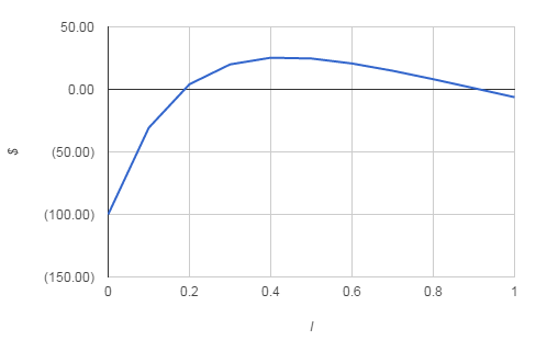
Multiple solutionsDepending on the exact mixture of the two types of investment in the cashflow, the curve can be made to decrease and then increase - forming a U shape; or increase and then decrease - forming an up-turned U. For example the cashflow: Year
produces the NPV graph shown below.
Notice that in this case the cashflow has two possible values of IRR. If you use the IRR function to find the IRR for this cashflow which solution you find depends on the starting value you supply the function as a guess. For example, IRR(range,10%)returns 18.37% but
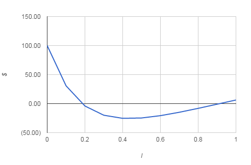
returns 91.35%. Both are entirely valid IRRs and in a more general case there could be more than two such values. Indeed, there are even cases where no IRR exists at all because the NPV curve is always above the x axis because the return on the investment is so good; or always below the x axis because it is so bad. When you make use of the IRR function you have to keep in mind the possibility of multiple solutions and try a range of starting values to see if the solution changes. Interpreting the IRRThe real problem, however, is not so much the existence of multiple IRR values, but how they should be interpreted. For example, if you apply the simple IRR investment decision making rule to the cashflow listed above with a market rate of 20% then, if you take the IRR to be 18.37%, you will reject the investment, but if you take it to be 91.35% you will accept the investment. Which is correct? The answer is that the use of this rule is too simplistic to cope with the realities of investment decision making. A true picture of what is happening can only be gained by examining the NPV versus I graph. From this you can quite clearly see that the investment is worth making for all values of I between 13.42% and 83.42%. because the NPV is positive in this range. However, you cannot conclude from this example that the range that lies between two values of IRR always corresponds to the acceptance range of interest rates. For example, if you take the same cashflow and change the positive sums to negative and vice versa the result is an NPV curve that is the ‘other way up’ with respect to the original.
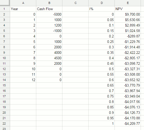
In this case the range of interest rates between the two IRR values produce a negative NPV and so for these rates the investment should be rejected. The acceptance region in this case corresponds to rates less than the lowest IRR and greater than the larger IRR value. The NPV graphBack in the days before the personal computer and spreadsheets there was a need for a simple measure of the ‘goodness’ of an investment. This led to the use of quantities such as the IRR as a simple index of profitability. However, as discussed, the IRR is flawed in that it simply marks the dividing line between positive and negative NPV values. In practice the region of positive NPV may correspond to a number of interest ranges. In this case there will be multiple values of the IRR, each one dividing an area of positive NPV from an area of negative NPV. What is quite clear is that the IRR is an attempt to simplify a situation which, in many cases, cannot be so simplified. The best way of understanding the true nature of a cashflow is by viewing the NPV v I graph. This tells you everything you could all need to know - all of the IRR values are clearly indicated and the regions of positive NPV. Fortunately construction an NPV v I graph is very easy with the aid of a spreadsheet - so much so that it should be a routine part of any investment analysis. Constructing a general spreadsheet that can cope with any cashflow isn’t easy because of the need to allow for the variable duration of the investment. However it is quite easy to construct a spreadsheet that can deal with any cashflow up to a given maximum number of periods. You can see an example spreadsheet below.
Column A and B contain the cashflow data. Notice that the year numbers are not actually used in the calculations and serve only to make entering the data easier. Column D is the range of percentages that the NPV will be calculated for. Tabulating the NPV for I ranging from 0% to 100% in 5% increments seems reasonable. Column E contains the NPV calculation. Enter into E2
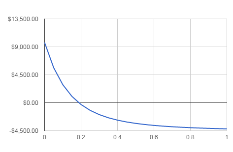
and copy this into D3..D22. After this entering a cashflow in to column B results in the NPV for the full range of rates being calculated. Notice that if the cashflow stops before the 12th period then filling the remaining cells with 0 will not effect the NPV calculation. Once you have the NPV table all that remains is to define a graph that shows the data correctly. You should select an XY graph with I as the X data or data series one and NPV as Y or data series two. The result, after suitable formatting should look something like that shown below:
From this graph you can not only see that there is a single value of IRR of 19% but you can also appreciate the sensitivity of the investment to changes in the assumed market rate. <ASIN:1871962013> <ASIN:B07S79ZVMQ> <ASIN:0470178892> <ASIN:0262046423> <ASIN:1119067510> <ASIN:078975584X> |